Thursday, August 20, 2009

Working Small


Business cards are a cool item. I did these drawings for a restaurant web directory founded by some friends of mine. The friends had the taste and judgment to hire SPUNK do do the design, and the design is the hero of the piece. Good design always makes art look exponentially better. Good design makes me seem like the kind of artist who works in a cool studio suite of 50s modern design with refurbished steelcase and Swedish furniture in a hip warehousy neighborhood. I actually do most of my work at an old kitchen table looking out at a leafy neighborhood view, resisting the urge to walk down to the lake. My inspiration for this art came from watching too many Tex Avery cartoons.

Monday, August 10, 2009

Roma

When I've spent time in a city it can be harder to illustrate a map of it. The things I remember, the places I liked, the cafés and piazzas I hung around in, insist on being included. Like the best stories, it's all about selection. And Rome is like a wonderful overstuffed museum, you step back to get a photo of a Baroque church and you stumble over a statue by Bernini. I walked Rome with a 1912 Baedeker in hand. A modern street map can tell you where you are but it doesn't capture the atmosphere of a place; it reduces the fabric of an ancient city to a soulless calculation.

Thursday, August 6, 2009

Health Care Surprises

I don't remember what the article was about, but this drawing captures the feeling we all get these days shopping for healthcare. It's like being run down by an ambulance. And billed for it.

Tuesday, August 4, 2009

Support for Education

I did this illustration for the New York Times. The op-ed was about education funding, or lack thereof.

Friday, July 31, 2009

Lotus, Lotuses...Loti?


Not the sports car... These were a few of several done for Landor. Somewhere I have several others more abstract, and in a way more interesting.

Thursday, July 30, 2009

L O V E

I painted this for my wife for our anniversary last week. Sometimes instead of a clever or disarming metaphor it's nice to just spell it out. (Illustrated lettering is an interesting solution for book titles and for magazine articles too.)

Monday, July 27, 2009

Back to School Shopping

The ads for pencils, erasers and school clothes have started appearing in newspapers already. You're reading the paper in the morning and out come these vilely colorful reminders of servitude. It is still July forgodssake. I am compounding the felony by inserting this art. Think of them not as tools of a dimly remembered punishment but as objects d'art. There is a certain "thingness" about a pencil sharpener drawn simply, and a pencil is just a hexagonal stick sharpened to a point with a bit of rubber at the other end.

Wednesday, July 22, 2009

Keys and Frets

A kind of still life I did for an alternative weekly. I honestly can't remember which one.

Tuesday, July 21, 2009

Invasion of the Moneylenders

When I did this illustration in 2002, articles were already being written about mischief in the banking industry. A cartoon machine seemed like the right metaphor at the time. I had no idea this drawing would become a business model.

Monday, July 20, 2009

The American Conversation

The topic was The American Conversation, a cross-disciplinary course about American thought and American thinkers and innovators. A fun project all around and a chance to do likenesses, not one of my usual categories. It was my idea to write the famous quotes on voice balloons cut from yellow legal paper––which I used then and still use when I write.

When it appeared in the magazine my art was superimposed on some stock imagery of stars and stripes, which took me by surprise. Illustrators and designers work best within an approval process, but stuff does happen. Did an editor or an editorial committee think the art was too drab as it was? Did someone think it required flags, and were they hesitant to ask me to paint an extra element? (I would have.) I recall giving the designer the license to move the elements around as needed; was this interpreted as license to collage my collage with someone else's stock art? I expect a deadline led to improvisation. I got several emails from people who loved what they saw in the magazine, but I was a bit embarrassed by it. I'll be happy to work with them again. The tricky part will be how I diplomatically suggest we not repeat what happened the last time. Next time the same designer will probably make my art look better than I expected. That's what usually happens.

Friday, July 17, 2009

Friday

It's Friday. Everybody dance.

Crystal Ball

I did this for an indie rock magazine called Death + Taxes, published out of Miami. Creative Director Joey Parlett. Story about a guy contemplating trends and other metaphysical shit. Sorry, I meant to say stuff. If you lie down with rock journalists, you wake up with a more colorful vocabulary. This reminds me of that Philip Guston painting of the eye staring at the whiskey bottle. It also reminds me of my short sweet gig doing biweekly illustrations for Rolling Stone. It was thirty years ago and Jann and I were much younger. This is a revisiting of the style I used then. Loopy, offhand, with the occasional disembodied head.

Thursday, July 16, 2009

Tea Anyone?

I did this illustration for a children's story I wrote quite a few years ago. Quite a few cups of tea have been consumed since and still no sign the story will ever be published. Thing is––everybody has stories. I'd be happy to illustrate somebody else's too.

Wednesday, July 15, 2009

Blue Sky Day

This is the kind of day it is in Minnesota. Can't get much nicer.

Tuesday, July 14, 2009

Paris Café Life

I did this illustration for the cover of a corporate magazine but I don't think anything in the magazine was about Paris or cafés or boulevardiers. But today is Bastille Day, so I thought it seemed an apt image. And who knows––maybe civilization will return to this side of the Atlantic. Maybe it already has, though not very many of us have the luxury of long afternoons spent discussing literature and culture.

Monday, July 13, 2009

Healthcare Treadmill

Even though most of the attention in Washington is focused on white male senators explaining why white men make better justices, and what's left is devoted to rich bankers insisting that rich bankers are the best ones to handle the stimulus money, health care is still the big issue. Bigger than Michael Jackson. This illustration is a metaphor for how our health-care system is set up now.

Thursday, July 9, 2009

Music Hath Charms, etc.

This LA Times story was about how piped in classical music curbed crime on the London Underground. The composer in police attire is Georg Friederic Handel.

Tuesday, July 7, 2009

Twin Towns

Now that we've finally chosen a senator, we can go back to the age-old rivalry between the two cities.

Monday, July 6, 2009

Cat Massage

For several years I did a monthly pet illustration for Safeway Foods' magazine, art directed by David Armario. Cats, dogs, fish, birds, turtles probably too. The feeding of, chewing of furniture by, buying presents for. It was almost like having a pet. Over time I became a little envious of the lifestyle I was being asked to depict. It's been years since I've had a good massage.

Thursday, July 2, 2009

Tintoy Metaphors

I found this in one of the boxes I keep art in. I collect old toys, and toys have often provided a medium for metaphor. This toy doesn't exist, but I constructed it out of bits and pieces of tintoys with their brightly printed surfaces and screws and flanges and seams.

What does it mean? The original drawing popped into my head at the time when aggressive CEOs were getting the legal go-ahead to seize worker pension funds. Sometimes the metaphor works better when it is suggestive rather than explicit. Although the fallout I'm suggesting is pretty explicit. And it's all come true.

Monday, June 29, 2009

Cute Kid

Last year my state fair people were all over the MTC buses, which was a cool thing, although it made my driving a bit erratic whenever I spotted one.

One of my greatest pleasures is simply inventing people: odd, familiar, usually comic but sometimes surreal or sinister. This crowd was pure friendliness. I was watching some 50s Warner Brothers cartoons over the weekend and was reminded of where my line comes from when I'm in this comic/friendly mode. The brisk, bright colors overlapping the lines, the uncompleted textures and jotted in backgrounds. I could imagine living in that world, or creating such a place for an animated film sometime. Anybody got a story that needs visualizing? Anybody know anybody at Pixar?

Friday, June 26, 2009

Jacko (1959-2009)


I did these two illustrations for my semi-regular gig in the LA Times Weekend Calendar. The question being asked was "What will Jacko do next to revive his career?" I had several ideas, but the Country Western album and Vienna Choir Boys concert tour were the funniest––and not entirely implausible.

Thursday, June 25, 2009

Can You Diagram Creativity?

The question came up while I was working on a project for Xerox, and this was the result. Is a diagram the same thing as a map? Maybe someone could do a Venn Diagram explaining this. The key with this drawing, as with all mobile and changeable things, was to work quickly rather than meticulously. The same logic applies to mapping cities: old cities can be drawn more slowly than modern cities, with baroque details and decorative borders, but modern cities' elaborations are more volatile and hurried. Modern creativity creates experiences and apps rather than permanent things, which isn't necessarily a positive change. Or so I think. What I think about I diagram or write about.

Wednesday, June 24, 2009

An Old School, A New Map

Well, not exactly new. Newish. I was sorting through some old material and came across this. Maps have always been a specialty of mine. Partly because I insist on having a map whenever I'm reading about a place. If a map isn't provided I'll draw one. This was for a rather deluxe booklet Rutka Weadock did for Miss Porter's School. Tony Rutka did the wonderful color treatment and art directed.

Monday, June 22, 2009

Bicycle and Crocodile

This is one of a series of illustrations I did for a corporate client several years ago. Illustration personalizes text in a way photography can't. Illustration is friendlier and more individual. Crocodiles riding bicycles is another thing it's easier to capture with a brush than a camera, though many have tried. The hard part was getting the crocodile to read the manual.

Friday, June 19, 2009

Hedges

I've spent a lot of time in the past year drawing metaphors for the economy. The word "hedge" often associated with the word "funds" conjures images that have nothing to do with what it is, what they are, other than the trimming that goes on.

Thursday, June 18, 2009

The World Game

I'm watching soccer with my son. (He had orthopedic surgery yesterday, and it helps pass the time for him.) I used to play the game, coached it off and on for many years, and met a few of the top internationals when I wrote articles about it. It is a game of sublime patterns and elegant players, as well as high and low drama. I've done sketchbooks of baseball players but should do one of soccer sometime. Its metaphors are universal, but, unfortunately, they are lost on most Americans. I did this illustration for an insurance magazine designed by Ted Lopez and Eason Associates.

Tuesday, June 16, 2009

Earth hasn't anything to show more fair

This isn't exactly the view Wordsworth was writing about. Westminster Bridge looks on the buildings the other way round. But there is a grandeur here that is fun to draw. The trick is eliminating the extraneous elements and drawing quickly. Sometimes I work directly from the perspective lines, as here. More often I do not, and it is the imperfections that set it apart from photographic reality.

Monday, June 15, 2009

Flowery

Sometimes a simple flower is best. Words are nice, but a rose is nicer. Is this a rose? It's no botanical drawing. It has a certain "roseness." I gave this to my wife who loves red roses. (She gets real roses sometimes too.)

Thursday, June 11, 2009

Kidlike

One occasionally does a very jolly friendly happy illustration. It's pleasant and I love it, but it does rather undermine my credentials as an ironist. A true sophisticate doesn't draw this way. It's exactly the sort of thing that made Dorothy Parker "frow up" and I hate to disappoint the ghost of Dorothy Parker. Still, it's a fun image, and for the use it was put to it did the trick. The art director was the estimable David Armario, so he should shoulder part of the blame.

Tuesday, June 9, 2009

Bookish

This might be a self portrait. I have a lot of books and when the kids were small they played havoc with them, tearing valuable pages, spilling words and letters all over the floor and refusing to clean up the mess. Two year-olds never do, do they? This drawing appeared in the Atlantic among the book reviews. The art director was the estimable Mary Parsons.

Monday, June 8, 2009

Pronouns & Inverted Commas


Punctuation and grammar are two of the mysteries I leave to others so it struck me as ironic when I was asked to illustrate a project about punctuation and grammar. These are two of the images that weren't selected at the sketch phase. A bit Philip Guston-ish, I think. When things perplex or intimidate us it sometimes helps to give them human qualities, faces and personalities. Not always though. (I have surreal dreams in which I am chased by dangling clauses and abused semicolons. They are usually armed.)

Thursday, June 4, 2009

I Can't Dance

Most people think they can dance, but I know better. I watch dancers with an awe just this side of worship. The way the hand moves, the way the arm balances what's going on with the leg, the tilt of the head, the arch of the back. Watching Gene Kelly always made me want to draw. I remember this flip book of Fred and Ginger that I used to sketch from. Anyway, here are a few from my dance sketchbook of a few years ago. Never published, but fun to draw and still fun to look at.

Wednesday, June 3, 2009

Statuary

The sketchbook has a way of turning up peculiar ideas. I think it's because there is no criterion, no subject. The hand draws what you are daydreaming, and the meaning is accidental.

Tuesday, June 2, 2009

Sportsman's Map of Manhattan

Illustrator John Held Jr. was famous for his 1920s depictions of flappers and their round-headed consorts. Less famously, he was the favorite social geographer of various top American magazines. He invented the mock-heroic phraseology I play with here. The "here there be monsters" legending that Columbus's mapmaker used to decorate the empty portions of the charts is replaced with sly japes. Instead of sea monsters and mermaids, I filled the waters off Manhattan with lox and sturgeon, and the woodlands of Midtown with wayward sporting types and their shooting boxes. There is (or used to be) a flytier's premises in or near Grand Central. All the clubs shown are real. The St. Moritz shown isn't the resort but a hotel. And Saks actually did have a ski school once. Ernie Blake, who founded Taos Ski Valley, worked there as a youth. I got my first (and only) Vanity Fair writing assignment after sending this map to Graydon Carter. I have done maps for the magazine since, as I also did for Spy, which Mr. Carter edited in a bygone decade.

Thursday, May 28, 2009

An Old Warrior

My best portraits are invented ones, pictures of a type rather than an actual person. This is a grave admission, which will deter people considering me for lucrative jobs depicting company chairmen and rock stars. Actually rock stars I might be able to depict pretty successfully; it's their persona you need to capture, not the subtle arrangement of nose and eyes and mouth, which have probably been rearranged anyway.

This old buffer is meant as a story: the expression of regret, the background divided between his country house and the Somme. The chicken is supposed to represent a long ago moment of cowardice. Right now I am trying to remember, were there tanks at the Somme? I don't think so. And I think the stripes on his Eton tie are a little too close together.

Wednesday, May 27, 2009

More Jazz

I love drawing jazz players. I think it's because I can't play myself. Unless you count stereo; I can play that.

Tuesday, May 26, 2009

The Terrible Truth About Grown-Ups

Story time was improv. Every night I'd sit down and wing it.

One night I decided to riff on the things kids don't know about grown-ups. For instance, that we play with their toys when the kids are in school. Sometimes we even let friends of ours play with their toys. The worse the behavior the more she laughed. If it's preposterous it's funny... but maybe it's actually true. That uncertainty makes it funnier. The tradition goes back to Struwehlpeter and to Belloc's Cautionary Tales, but these tales don't warn kids to behave. The idea is to warn kids about grownup behavior. The bias probably shifted to the child's side with Roald Dahl. Like I said, I hope I'm able to get this published before my kids are grownups themselves. They might not think it's as funny then.

Wednesday, May 20, 2009

Story Time


We live in one of those circular houses where the dining room opens into the hall, which opens into the living room, the T.V. room, the kitchen, the pantry and into the dining room again. When our children were small we liked to play a game, which we called “Chase.” I would walk and they would run away from me, all shrieks and laughter, around and around the house. The game was most popular at bedtime when they wanted to avoid me anyway. I’m not sure if the game wound them up or tired them out, but at the strategic moment they would choose the escape route up the stairs. I never explained to them that this meant that I had won the game.

Madeline always preferred her mom at bedtime: Mom’s special interpretation of Peter Rabbit, Mom’s way of straightening the room and drawing the curtains, Mom’s lap, Mom’s hug and kiss goodnight. No boys allowed––until recently. It may have been a night when Mom was away at her book club. The game of chase was full of the usual shrieks and laughter, but they turned to tears as we went upstairs. It was too dark outside. I was reading all of the books the wrong way. I managed to get her into bed. I tucked her in and turned out the light, but I wasn’t Mom. So I told her a story about how, when I was her age, I had a dog named JoJo, and how JoJo had missed his mom and had decided to write her a letter. I have been a part of Madeline’s bedtime for a long time after that.

There was something wonderful about sitting there beside her bed in the dark and filling her seven year-old head with lies. I did have a dog named JoJo, and he was a dachsund, and he did like to run away at the drop of a hat (just like Madeline), and I was once a child exactly her age, but JoJo didn’t write letters to his mother or to anyone else, nor did he decorate our Christmas tree one year with my sister’s flowery underpants, nor did he ever play minor league baseball or climb trees. But she didn’t know this, and if she suspected she didn’t told me.

There was a certain amount of pressure every night. I never tried to think of a story until the lights were out. Sometimes the story wasn’t terrific, and there were many wonderful, densely-plotted tales which she didn’t heard all the way through because she’d fallen asleep, which was the point after all. Or was the real point that I’d found a way around the “girls only” policy at bedtime? I’m happy I did, for a while anyway. And I did it not by reading one of the four or five new books about fathers and daughters that come out every year. I just stumbled across it in the dark.

(The drawing is from my sketchbook. The story was published a few years ago in a magazine for fathers and daughters. I'm hoping some of the stories I invented and told to Madeline during that time are published before she is done with college. We'll see.)

Tuesday, May 19, 2009

Moon in Hand

I like spending time in antiquarian bookstores. I seldom find what I am looking for, which is exactly the point. Finding what you didn't know you wanted or needed is more fun. It adds something to the work, whether I'm writing or illustrating. I think it's called "cross-bred vigor." Uniformity is boring. So, I wasn't looking for it but I found a book filled with Renaissance and Baroque imagery: moons, suns, heaven, hell, planetary machinery, angels and demons, a catalog of supernatural rigamarole. I'd forgotten how to crosshatch, but it was fun relearning it. Dead masters can teach you a lot.

Monday, May 18, 2009

Smoke

The cigar has fallen on hard times. Once the sly device of witty men who used it to make you wait for a punch line––think Groucho and Churchill, Ernie Kovacs and George Burns; Bugs Bunny substituted a carrot––it's now the thing lobbyists light up. It's the only item certain oversized, overpaid men can still hold at a jaunty angle. It remains a useful device for metaphor. Cigars signify money and power even if they no longer imply wit or polish. This drawing appeared in my sketchbook in the week when Bush did something especially sneaky to the Clean Air Act.

Thursday, May 14, 2009

Of Bell Jars and Education

This art appeared in yesterday's New York Times, on the home page and the op-ed page. It's amazing how many people notice this small spot. I've gotten comments from people in California and Europe on these little thumbnails. The challenge of squeezing what is sometimes a very complex idea into a small space is formidable, and the turnaround is very very quick, a couple of hours. But it's fun.

Monday, May 11, 2009

Home Renovation

This LA Times story was about the hassle of renovating a house while living in it. Sharing domestic space with workmen is a familiar nightmare. Nice as they are, they steal your privacy and comfort. They arrive every morning early, armed with two by fours and hammers and the noise of electric drills. I drew this couple and their dog as bemused hostages. Another fun opportunity to take the roof off a house and see what is happening inside.

Friday, May 8, 2009

Plain Ordinary

I had a few minutes and a bit of paper and this is the result. I like it. It isn't about anything. He's nobody in particular. It's not a self portrait.

Tuesday, May 5, 2009

Swiss Army Model

My friend Michael J. Rosen was doing a book about the ubiquitous Volkswagen and asked me if I wanted to contribute some drawings. I did. I love projects where I get to draw whatever I can think of. This is my favorite of the things I thought up about the VW. The opposite of Bond's Aston Martin.

Friday, May 1, 2009

Della Francesca

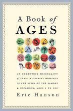
This dot series I painted for gallery sale also got into American Illustration, but it never caught on in everyday illustration assignments. Why? I suppose it's process. I paint the dots, then I paint the iconography freehand. It's hard to run that through a sketch approval process. These I painted by taking small details from paintings by Piero Della Francesca. I was recently back from Italy and still agog over everything Italian. One use I've gotten out of this dot style: the cover of my book. (See right.) The gallery that sold my paintings recently closed. I'm looking for a new one.