
Wednesday, December 29, 2010
Wednesday, December 22, 2010
Christmas in Minneapolis
I did this drawing almost thirty years ago. My dad started me out in the Christmas card business when I was twelve. I sold them door to door around the neighborhood, using the money to buy ski equipment. By the time I drew this one I was selling in department stores and card shops around the cities. My parents tell me they prefer this style to the stuff I do now. It's hard to believe the same person drew them. Does anyone recognize the house in the picture? It's famous.


Monday, December 20, 2010
Department Store Christmas
I spent my early childhood in suburban Chicago, which meant every Christmas we made a trip downtown on the train to see the decorated windows at Marshall Fields, visit the toy department and Santa, and stand in line to eat lunch in the Walnut Room beside the enormous Christmas tree. That's what I'm remembering when I hear Christmas music today and what I was picturing when I painted this Christmas card for Graphique de France several years ago.


Wednesday, December 8, 2010
Santa
I must have drawn hundreds of Santas in my life. Fat, thin, jolly, grouchy, sly, businesslike, none particularly saintly. It's hard to associate him with the modern day celibate, scolding priests. Let's face it, the Santa we know was invented jointly by Coca Cola, Macy's, Norman Rockwell and television writers. Nothing I can draw can undermine that. My favorite anecdote from my book is about Shirley Temple, age 7, losing her belief in Santa when he asked her for her autograph.


Friday, December 3, 2010
Gift Season
Note to self: do not suddenly remember to buy gifts on the 24th this year. This is one of the images I did for Barneys a few years ago. Fun to imagine a businessman with butterfly wings.


Thursday, December 2, 2010
Holiday Art
The holiday music began on Minnesota Public Radio the day after Thanksgiving. I like it. It seems early, but there's snow on the ground already. I notice the Hanukkah songs and the Christmas carols sound interchangeable, but then both events took place just a few miles apart.
I remember when I was a kid, I was allowed to bring out one Christmas record each day. It usually began with Perry Como. My kids have no idea who that was. When I was in the Christmas card business I'd be starting the art for the following year right about now; the music helped the inspiration. I did this drawing for the Wall Street Journal several years ago.

I remember when I was a kid, I was allowed to bring out one Christmas record each day. It usually began with Perry Como. My kids have no idea who that was. When I was in the Christmas card business I'd be starting the art for the following year right about now; the music helped the inspiration. I did this drawing for the Wall Street Journal several years ago.

Wednesday, December 1, 2010
Still Life With Businessman
There is something wonderfully straightforward about still life. It asks the viewer to make sense of the adjacence of unrelated things. Because they are arranged like a place setting are they to eat? Should the head of a businessman be eaten with a salad fork or a garden trowel? What does Emily Post say? I used the same kind of principle to arrange the entries in A Book of Ages (Harmony,2008/Three Rivers Press,2010), without comment, without footnotes, hoping the reader would see the ironies that emerged. I may have been too subtle about it. (The book remains the perfect gift item for your hard-to-amuse brother-in-law and every bookish person on your list.)


Monday, November 22, 2010
Turkey
This is a drawing I did for the Wall Street Journal a few years ago, depicting how I find my turkey every year. Once again, there is a special charm in simple black line art.


Wednesday, November 17, 2010
Deciderer, Part II
I did this drawing in the messy, expensive aftermath of Bush's "victory" in Iraq. It's jarring to make a comical drawing of someone who created so much harm and crisis.


Tuesday, November 16, 2010
Thanksgiving USA
I got a fun asssignment from Family Circle last month. (A very smartly designed magazine; if you haven't looked recently, do.) The geography of Thanksgiving idea is reminiscent of a Geography of Christmas map I did for Graphique de France a while back, but it also reminded me of those elementary school murals we did of pilgrims and Indians and turkeys and the whole scene. Cut paper and paste. FC Creative Director Karmen Lizzul is one of my old friends from SPY magazine, where I did several maps for her.


Thursday, November 11, 2010
Visualizing Words, Chapter 1
Illustration is harder than it looks. None of the effort is supposed to appear on the paper. And a lot of my work time is spent with my eyes closed or looking into space, trying to visualize a metaphor. This drawing is one of a series I did for WWWord, the new online magazine for word people: editors, writers, poets, teachers, readers, grammarians, crossword puzzlers, scrabble players.
Quick––bookmark it!

Quick––bookmark it!

Tuesday, November 9, 2010
Suburbia A to Z
I've been working on textile designs for the past several weeks. This was just one of the ideas I worked up. Fabric has always made me think of the domestic landscape; the way patterns and shapes are repeated, the harmony of colors. I've been working on a book following the long unfolding story of a road in a more linear fashion. This image is a variation on that. A short excerpt from a remembered suburbia.


Monday, November 8, 2010
Bush Jr. Returns
Junior is back on TV this week, touting a new book about how he grappled with decisionmaking. One can almost picture it. Anyway, I thought it might be worth trotting out this diagram I painted for the New Yorker. This is as accurate a picture of the Bush White House's decidering process as I've seen. Flow charts are a very useful form. A map of a thought process or a criminal transaction or, in this case, a muddled philosophy.


Tuesday, November 2, 2010
Tea Party Politics
This is one of three sketches I did for a New York Times editorial page assignment. The topic was the Tea Party. They went with the simpler one of the hand holding a ballot, but I liked this one best. I probably should have included a few dollar signs in the voice balloon, since the Tea Party was organized and funded by two secretive New York oil billionaires.


Thursday, October 28, 2010
Leafy Thoughts
The leaves all blew off this week. The other night it sounded like a train was going past the front porch. Makes you wonder what's the point of all that foliage, all that wonderfully shaped and twined leafery.


Wednesday, October 27, 2010
Cool Cats
It's my son's birthday, which means a new bit of art from Dad. Here's the card I drew for him: three cool cats. This year he's got his own radio show on the college station, which means I get to listen to him every Tuesday evening at 7. The program's name Cats at a Tea Party is heavily ironic.


Wednesday, October 20, 2010
Road Rage
A friend of mine wrote about road rage in my paper this morning. I have a few stories about that; we all do. Everybody's stressed, anxious and easily pissed off. I did this illustration for Plan Sponsor magazine a couple of years ago, under the excellent art direction of Soojin Buzelli. Looking at it again, the guy on the left reminds me a little bit of the bull in Picasso's Guernica.


Tuesday, October 5, 2010
A Window in the City
I painted this for a calendar back in the '90s, one of several I did for a Japanese cellphone company. It's fun to imagine what it's like to look out at a city scene like this, each window framing another private life. My window looks out on treetops, kids on the sidewalk, the cottages across the street and the lake two blocks away.


Tuesday, September 28, 2010
An Old Map of a New City
Well, new-ish. People don't realize that L.A. was a few orange groves and unpaved streets a hundred years ago. Fewer realize the discovery of oil made it into a city. Movies were incidental. I did this map years ago when I was doing regular maps for Rolling Stone. I've come back around to this kind of linework, but now do it in pencil, mostly. There is something wonderful about pictorial shorthand. It's almost hieroglyphic.


Wednesday, September 22, 2010
Portrait of a Crowd
People in an elevator? It looks like that. Actually it's a thumbnail from a drawing I did depicting America's suspicion of otherness. Our suspicion of immigrants and other ethnicities and other religions. When it comes right down to it, we are not very tolerant here, despite being a nation made up of others and immigrants, a nation founded by free thinkers, founded to welcome other religions. Divide and conquer is an ugly strategy, except it works very well. Especially when there is money behind it.


Tuesday, September 21, 2010
Eccentric Architecture
I posted the pencil drawing of this old mansion a few months ago and just recently added color. Like a Ben Shahn drawing of an old man or David Stone Martin's jazz musicians, or jazz itself, the trick is in the slight distortions, the imperfect details, the odd angles. An interesting drawing isn't necessarily a direct quotation from life. Same with the color. Picking orange gave the image more life. Leaving the other colors in more subdued hues make the orange brighter. There is a "thingness" about architecture, about individual buildings, that's harder to capture with a camera. Painted portraits are looking for something the lens doesn't see.


Monday, September 20, 2010
Mr. Park Ranger
When I think of park rangers I think of Yogi Bear and a song starts going through my head. It's going through my head now and will continue to for most of the afternoon. Cartoons are a constant influence. Mostly Bullwinkle, but also Quickdraw and Yogi and Babalooey. I've always worked with brush on paper. Adding digital color to a brushed line, as I did in this piece for the Sunday LA Times, brings me closer to the look of flat paint on cartoon cels. It's a bright, interesting look, and a new variation for me. I've always admired people like Seymour Chwast and Steve Guarnaccia for their pure colors, without drying lines. This brings me closer to that too. But I still use a brush and a pencil.


Wednesday, September 15, 2010
What's Inside Our Heads
There are things we can only understand by comparing them to something else, something different but similar in some way. We understand by analogy and metaphor. Science couldn't understand the mechanics of the human heart until the steam engine was invented. The mind is a persistent puzzle because its workings are invisible, but we understand it a bit better because we've created artificial intelligence. The brain works a bit like the internet, with all its imperfections and unreliability. Firing off thoughts, collating them, making judgments, balancing belief and disbelief. I guess that's what this drawing is about. It's a sketch of a floating metaphor. The guy contemplating it from above makes me think of Rembrandt's painting of Aristotle contemplating the bust of Homer. I always think of that painting when I pull down our Julia Child cookbook with its photograph of Julia contemplating a lump of bread dough.


Tuesday, September 14, 2010
Method and Simplicity
Marshall McCluhan said something about media and messages which sounded simple, but it took him a whole book to explain it. Here is a picture that does it more simply. McCluhan's book wasn't really a set of instructions anyway.


Wednesday, September 8, 2010
Birdy with a yellow bill

I was reading a piece Roy Blount wrote for the Times about E. B. White. He was remembering an essay White wrote about robins, which made me think of this painting I did a few years ago, thinking it would look nice on a magazine cover in April. I associate robins with the New Yorker. Abe Birnbaum did a perfect cover painting of a robin once. Maira Kalman did a wonderful robin too. There is something about the orange and the dark gray just lighter than black, the yellow bill, the spindly yellow legs. I identify with them, apart from the bill, and the orange and dark gray. The way they listen by cocking their heads. The spindly legs I do have.
Tuesday, September 7, 2010
Schoolbuses
If there is a brand icon for public education it would be the yellow schoolbus. Funny they never sued the private and charter schools for brand infringement. Anyway, this is a drawing I did for the New York Times op-ed page (ably art directed by Aviva Michaelov). Sometimes when they choose another drawing from the assortment I present I go back and finish the ones not picked, just for my files, and for my own pleasure. The op-ed pages are black and white, after all, and what is a schoolbus not painted yellow?


Wednesday, September 1, 2010
Fish Photography
I got a call from the New Yorker a few years ago. They wanted a spot illustration on the subject of fish photography. I bet you visualized fish with cameras just as I did.


Tuesday, August 31, 2010

Wednesday, August 18, 2010
Funny and Mean
I have always had a hard time making fun of people, by that I mean drawing them funny, making them look ridiculous. What does that say about me? Am I a coward or just a nice guy? I don't have the same hesitation in my stories; meanness is the soul of satire. And in my drawings I have less of a problem making fun of men, but I am always kinder to women. I feel bad when I satirize them. I guess this follows the first rule of humor: that it's always funnier to make fun of yourself or your own kind. I did this illustration for Bon Appetit a few years ago. The article was about wine; I drink wine, and the art is fairly merciless. And amusing.


Tuesday, August 17, 2010
Travelers
I did this illustration for Condé Nast Traveler for the editorial opener. There is a trick to doing character drawings as small as this. Differences in personality are as much a matter of posture and hair and less about faces at this size. I was working on a set of dishes for Pottery Barn at around this same time and pitched the idea of doing the figures small and quirky like this. Quirky didn't fly. Not for tabletop. But I think this kind of drawing would function perfectly online these days. Did I mention that all of these characters are copyrighted? They are. They await your call.


Wednesday, August 11, 2010
Mixing Metaphors
Some years ago I came up with this idea for a story about Japan's reaction to American competition. There has always been a kabuki element to business competition, wherever it is. The toy drummer functioned well as the American competitor. The illustration generated concerns about stereotyping and we went with a different concept, but it's this one I remember. Stereotypes are easier to remember, which is why we use them. The painted faces of kabuki and geisha tradition are stereotypes themselves. They aren't my tradition though. Do I have any business using them? They should be handled carefully in any case. Even though the American is the clown, and the geisha was drawn directly from an old Japanese print, I wonder if this painting was disrespectful of both nationalities.


Monday, August 9, 2010
Kid Suburbia
This is a drawing I did for one version of a children's story I wrote a few years ago. I don't usually depict the landscape with deep perspective like this. My compositions tend to be flat––all subject, no background, no context––so this was a departure. Even when I am in a realistic mode, with perspective and everything, I tend to imagine the drawing rather than working from reference. This filtering subtracts extraneous material and adds the quirks and oddities that make the art personal. This is probably as photographic as I get, but the light is flat and the background is blank. It's the suburbia I remember from years ago, a bit like the world Charles Schulz depicted.


Thursday, August 5, 2010

Monday, August 2, 2010
Staying Cool
I remember spending the hottest days of the summer in a friend's basement reading the Ski and Skiing magazines from the previous winter. Later, this was the time of year I wrote my articles for Skiing, about Squaw Valley or Big Mountain or Deer Valley. It's not a bad way to stay cool. I did this illustration for the opening spread of Snow magazine. The issue also contained a feature I wrote about the evolution of ski fashion.


Thursday, July 29, 2010
Bicycles and Euro Style

I did this image for a poster show designer Andy Powell organized at The Bikery, a bake and bike shop in Stillwater. The show is on into next week with plans to continue at the Bikery's new location in Marine-on-St-Croix.
The Bikery
904 4th Street South
Stillwater, MN 55082
An Interesting Face
I painted this for an African American magazine some years ago. An interesting assignment, but I remember having to repaint it because I'd gotten the skin color wrong, which surprised me. I don't know whether this was the acceptable version or not. It shows how sensitive we are to shades of difference. I did art for a Japanese liquor ad once. I remember being very careful to get the Japanese face just right, clearly Japanese but short of stereotype. The client kept having me adjust features: the nose, the skin color, the eyes. Finally they instructed me to make the hair blond. I told them I was confused; didn't they want the person to appear Japanese? No, they didn't. But instead of telling me so outright, they'd had me remove the ethnic distinctions one by one, and I'd carefully done so.


Wednesday, July 28, 2010
Love Thy Job
I think that was the subject described here. I love my job, even though it isn't set in an impressive office building.


Tuesday, July 27, 2010
A Dog and His Servants
I found this in my box of drawings the other day and thought "what an odd drawing." A dog whose needs are met by a butler, a chef, a housekeeper? Probably not so unusual in some neighborhoods. I'm sure there's a funny children's book written along these lines.


Monday, July 26, 2010
A Kind of Cowboy
I went to see Iron Man 2 with my son and a nephew over the weekend and was reminded of this painting I did a few years ago. Superheroes are a form of compensation, filling in the male audience's inadequacies. The same is true of large motorcycles and large guns. Is this a purely American phenomenon? It was very European prior to 1945, and I suppose the Soviets were a kind of cartoon. This image was in Lurzer's Archive's 200 Best Illustrators Worldwide. You never know why Europeans pick what they pick.


Friday, July 23, 2010
Ball Games
Heading into another summer weekend, I am remembering the games played many years ago, chiefly whiffleball. Basketball was played earlier in the year in our neighborhood, soccer later, football in the fall, winter was spent at the ski hill down the street. Whiffleball was perfect because it didn't require full teams or large yards. Baseball was organized; there were coaches who yelled at you, and umpires who called you out. Whiffleball was played with a ball that was lighter than air. It was disorganized, freeform, games usually broke up over disputed plays, making it a perfect reflection of childhood's dynamics. I did this illustration for an article in the Atlantic about a serious grown-up whiffleball league in Florida. Grownups always find ways of killing the joy of the game. I did my best not to flatter the athletes. Note the cleavage on the player in the middle.


Thursday, July 22, 2010
Saxophonic
Another card from that deck created by Lisa Catalone. Simple line + bold, slightly offset color. She typeset from a font she and I created. Wonderful, really. (If I were a designer I'd know how to scan the printed piece minus the strobe effect.)


Wednesday, July 21, 2010
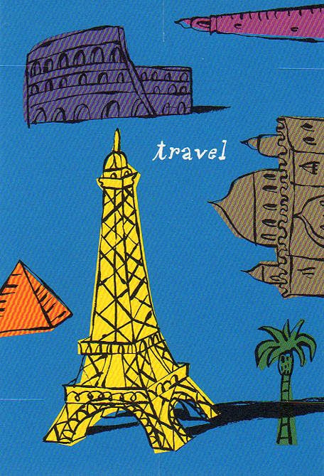
Travel
I've been in the travel business all my professional life, as a mapmaker and travel writer, but also trading in the iconography of places. When you think of a place what do you see? What is the single piece of architecture or landscape that serves as a marker? When I am doing an illustrated map it's these items that I arrange on it, like furniture, or photographs set on a piano. India=the Taj Mahal. Paris=the Eiffel Tower. Egypt=Pyramids. Etc. Tourist shorthand, but useful. This card was designed by Lisa Catalone.

Tuesday, July 20, 2010
Celebrations
The household chore I enjoy most is that of resident artist. I am the one who draws cards for friends and family, cousins, in-laws, aunts, for birthdays, anniversaries, graduations, bar mitzvahs. I get to be my own art director––and tend to be pretty demanding. This was the second idea I painted for the occasion yesterday, and much better than the first one.


Monday, July 19, 2010
A Campus Map
Maps are usually contained inside rectangles, and over the years I've become adept at decorating those rectangles, but once in a while a map is needed for an odd shape. It's fun when this happens. It's especially challenging when the shape doesn't match the landscape being set into it. Distortion is a useful tool, one mapmakers use all the time; after all our continents are inscribed on a globe, not a flat sheet. Catalone Design needed a map to go on the inside of a fold-out box designed to contain Q&A cards. I thought it was interesting that the shape is cruciform; the client was a Jesuit school. There is a bit of Ludwig Bemelmans and Abe Birnbaum in the handling of the buildings and the patterning in the trees. A nice piece altogether, thanks to the art direction of Lisa Catalone.


Tuesday, July 6, 2010

Wednesday, June 30, 2010

Tuesday, June 29, 2010

Friday, June 25, 2010
Cafe Society
Friday afternoons in the summer should be spent at a sidewalk table. I did this illustration several years ago for the Philadelphia Inquirer, art directed by Sue Syrnick. It was included in the American Illustration annual for that year.


Thursday, June 24, 2010
A Father, A Son and a Boat
I did this illustration for one of Nickelodeon's magazines. I think the boy might be imagining himself as George Washington.


Tuesday, June 22, 2010
Big Hair
I did a series of drawings about hair for the New Yorker, never used. But the extravagances conjured up were a lot of fun. I also wrote a picture book along the same lines. Children love exaggeration. Unfortunately, very few of them are editors. This drawing appeared in American Illustration.


Subscribe to:
Posts (Atom)


