Thursday, May 9, 2013

Camera Setting


I've been drawing cameras for several years. Old cameras have a "thingness" that makes you want to pick them up and operate them. Irresistible. I remember on one of my trips for Skiing magazine, taking an old Rollei compact with me. It was built like a very small tank, armored, impregnable, to keep the light out I guess. A lot more cumbersome to ski with than my small new model Zeiss. Naturally I took b/w photos with it, trying to imitate the classic German ski photos of the 1930s.

This drawing is one of a series of Settings. The title is fun. I would take assorted objects and arrange them as if they were a place setting at a table, as if I was preparing to eat them. Delicious. This drawing appeared in The Believer.

Monday, May 6, 2013

Freudian


In honor of Freud's birthday, here is a painting of Freud and Jung kissing.

Freud appears 13 times in my book. When he saw his mother naked. When he got his famous couch. When he started collecting totems. His attempt to stop smoking. A list of who he got birthday cards from when he turned 80. An altogether interesting life.

Wednesday, May 1, 2013

Fiction Illustration in the New Yorker

I got a call from Awan Jordan, an illustration editor at the New Yorker, who wanted me to illustrate a story for an upcoming issue. The story (The Fragments by Joshua Ferris) involved a New York snowstorm, a relationship, and a stream of cell phone conversations, overheard in fragments like a Greek chorus. Awan suggested including handwritten bits of these conversations in the art. I welcomed the idea and got to work. I've been working with layers and patterns of handwritten text for some time in my art, and I've always done a lot of diagrams and maps. Quick, informal longhand seemed to work, imitating the feel of intimate conversation.

The first idea was to create a palimpsest of overlapping handwritten fragments, which I did several different ways. I liked the effect, but it seemed more like overlapping dialogue, like in an Altman movie, rather than a series of discrete fragments of private talk.


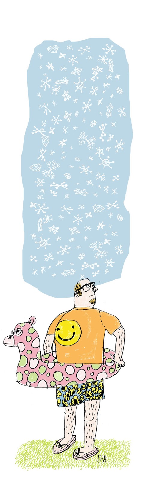
So I thought of something else, something I'd never tried before: inverting the lettering and shifting it into color and cutting and pasting it together. I'd do this in shapes rather than in strips. It's hard to do a sketch of a collage. It makes more sense to do the finished art right off, to see if it works. This is what I was doing. I'd gotten the call at the end of the week and promised sketches on Monday, planning instead to show several finished illustrations and see which they liked, reworking them as needed. This color illustration of bright lettering collaged together was invented as I was trying it out, and it worked pretty nicely. There was a bright Miro-ish playfulness to the shapes and the palette (including a certain amount of pale and gray colors made the other colors brighter and also helped echo the feel of the snowstorm in the story). The composition suggested one large voice balloon comprised of all these simultaneous conversations, all these relationships working themselves out in the air during this snowstorm. (I added snowflakes to this version too.)


This seemed perfect to me, but it didn't resemble the style sample Awan had liked initially, an overlapping diagram in two tones of blue that I'd sent him a few months ago. I went to bed loving the bright collage I'd done, but half of my mind thinking of how I might create something more in the style he'd suggested. Next day I rewrote the bits of dialogue and inserted them into voice balloons, shifting the line into the two blue tones from the style sample he'd liked, and assembled them on top of the earlier palimpsest that I'd also shifted into cool wintry blue shades. Then I inserted a semi transparent layer behind the voice balloons to help them show up better. 


This is the one that ran in the magazine this week. Awan had the clever idea of inserting the story's title into a voice balloon in the middle of the page. Brilliant touch.


When it came in the mail my wife said "After years of submitting your stories to them, you can finally say you've had your writing published in the New Yorker." (She's much wittier than I am.)

Thursday, April 11, 2013

False Spring


April has always been a cruel month. For the past few days the talk has been about the predicted six to twelve inch snow we'd get today. I woke up this morning and they were saying 3-6 instead. Still... The StarTribune writer Bill Ward wrote a clever piece about what Minnesotans should do to defy this late winter weather and they needed art for it, so I drew this surly chap in his sandals and sea monster innertube looking up at the snow. Enjoy. 


Thursday, March 7, 2013

How Not To Cut

I woke up Monday morning to an assignment from the NYTimes. One of those neat little drawings that draw the reader's eye to the letters on the editorial page. Maybe this is why they are called drawings.

The subject was the one on everyone's mind: the draconian sequester cuts––it's unusual when two of the three words describing the issue of the day are words nobody uses much and most people couldn't define for you. We have half the country enthused (to the point where they should maybe go lie down) about cutting federal spending. What's interesting is the people most rabid about cutting are the ones whose lives and whose districts would be most negatively affected. Here's where we enter the realm of unintended consequences. ("Honestly, doctor, I didn't realize I shouldn't cut that branch closer to the trunk than the point where I was sitting on it.") It's the Red Districts that receive most of the federal dollars and they also, conveniently, pay less in taxes than they receive. There is a Snopesian cleverness about this which I almost admire. But it is hard to squeeze all of these thoughts into a drawing the size of your thumb. So, as always happens, I resorted to metaphor. And there is actually a thumb in the metaphor, although it isn't the thumb which the budget cutter is about to sever.
Point is, we don't always think about deeds and consequences. Sometimes wars cost money. Sometimes poisoning the air winds up poisoning the people who breathe it. Sometimes cutting federal spending during a severe economic downturn ends up cutting the only spending that's happening. At which point the economy begins to lose any semblance of a pulse.

Republicans and rich people like to give advice to the poor about thrift, but only poor people know thrift.  They are experts at it. The Republican gasbags (there are Dem gasbags too) like to preach the morality of spending cuts "to save our children". They preach austerity while driving large cars and owning twelve homes. Forcing austerity measures on an economy during a recession is like starving your children to protect their inheritance. Which sounds stupid, but to rich people it's actually smart, because after the children of the poor starve, their money carefully unspent will remain in banks where the rich can go on playing with it. I enjoy drawing pictures describing damnfoolishness like this.

(I would like to thank Ben Shahn and Ludwig Bemelmans and a few others who taught me how to draw hands and papercutters.)

Monday, February 18, 2013

Valentine


I did Valentines for my near & dear last week, as I always do.

This is the one I did for my very dearest, Faith.

Saturday, February 9, 2013

City Snowfall

I drew this picture of an imaginary New York during a real snowstorm here in Minneapolis, probably 30 years ago. I worked exclusively in pen in those days, a style suited to the black and white world of a snowstorm. I loved snow more then than I do now.

Tuesday, February 5, 2013

"18"


 Madeline turned 18 today. This is the card I drew.
I drew this M on the envelope.


Thursday, January 31, 2013

Lumberjacks!


I did this illustration last week for my local newspaper, the StarTribune. The article was about how metropolitan types are now adopting the style of lumberjacks... At least here in Minneapolis.

Monday, January 14, 2013

Zen Illustration

I illustrated a series of short first-person essays for the January issue of Shambhala Sun magazine, art directed by Liza Matthews. This is the opener with title lettering. She'd liked the letterforms I used for the book Orientation (Faber, 2011) so I used that same style here. Like zen, drawing that appears effortless and relaxed is never as effortless as it seems.

Wednesday, January 2, 2013

POETRY magazine cover for January 2013

I drew this a couple of years ago as part of a portfolio I showed to a San Francisco collector. It was one of those he didn't pick. Looking back on it now, I don't think he bought anything. But it's from these discard piles that I often find my best work. And often it's among concrete things that I find the strongest iconic associations. The poetry of shape and function I guess. It made it suitable for sending to Alex Knowlton who art directs POETRY magazine. I remember thinking how a wound electrical cord resembled the mathematical symbol for infinity. I darkened the pencil line and added the color afterwards. I especially like how the color turned out. Bold and simple. I don't get to work in orange often enough.