
Friday, February 26, 2010

Thursday, February 25, 2010
Begs For Animation
Something about the ephemeral line, the little smudge of fingerprint (or is it sweat?) around the edges of the drawing, suggests animation. Drawing is temporary to begin with. It's less permanent than paint. A scrap of paper, a pencil pulled from a pocket, something seen that won't be there in a moment. So why not animate the pencil drawing itself? Of course I didn't see this guy in his running shorts; I made him up. I gave him that serious expression, the average physique, the short socks and shorter shorts. I drew him and as a joke on him I put that chair in his way. He hadn't expected it, believe me. Someone will need to animate him for us to find out if he cleared it.


Wednesday, February 24, 2010
Olympic Fatigue
Maybe it's the costumes. Or the announcers. The short skis. The kiss and cry. The earth-shaking achievements of athletes on snowboards. Are they athletes? Are bowlers athletes? Was Evel Knievel an athlete? Do I have an opinion?


Tuesday, February 23, 2010
Man and Horn
There is something about pencil line. It seems to come right out of the imagination, without hesitation or thought or technique.


Monday, February 22, 2010
Metaphor (With Shoe)
Sometimes a little drawing will surprise you. I mean, what is this supposed to mean? Is he downtrodden? Is he a creative director for Kenneth Cole? Is he channeling Philip Guston? Whatever. I drew it on Friday and have felt smug about it all weekend. Not a bad feeling. Anybody who looks at art gets to make up his own mind what it's about. I hope you like it.


Friday, February 19, 2010
An Eager Student
I remember one kid who not only raised his hand and waved it; sometimes he'd start running down the aisle towards the teacher's desk. He didn't always have the answer, but he thought he did. Maybe I should write a story about him. I didn't raise my hand very often. Probably because I was too busy drawing airplanes and battleships. I still do airplanes once in a while, but I haven't been asked to draw a battleship in years.


Thursday, February 18, 2010
Tailor's Dummy
Fashion furniture like this invites a bit of Joan Miro, a bit of Max Beckman, reducing a thing made of fabric into a piece of machinery. It isn't easy because fashion is so vertical and drapy.


Wednesday, February 17, 2010
Birds in Tree
I'm a student of patterns. How leaves fill a tree's interior space, how vines occupy a fence, how blackbirds organize themselves in flocks, organic and inorganic patterns like brickwork and windows on tall buildings, the way people sprawl across grassy spaces. Knowing the algorithm for such things would ruin it. Everything can be reduced to numbers, but I'd rather paint them. Patterns are reassuring, which is why we put them on wallpaper and fabrics and wine labels and dishes. Pattern is the counter-argument to randomness and disorder. I often insert an element of imperfection, though, to keep it from seeming precious. There are dead branches lopped off here and there and I don't think the birds like each other very much.


Tuesday, February 16, 2010


Monday, February 15, 2010

Sunday, February 14, 2010

Friday, February 12, 2010
Exercise
They say exercise is good for you. I did this illustration for a seniors magazine. The editors might have been visualizing a circle of old people doing something with colorful scarves. But that would be unambitious, the sort of thing you ask a photographer to capture. An illustrator can get a well-toned septuagenarian to lift 500 pounds. Easy. Kind of makes you think.


Thursday, February 11, 2010
Life's Merry-Go-Round
Carnivals. Cute children, cotton candy, games, carefree summer nights, singing crickets, carnival barkers advertising rigged games of skill, carnies, sideshow freaks, crime, carnality. This illustration leaves out the darker side, which is what calendar art does. Leave the other side to films like Gun Crazy and Strangers on a Train.


Wednesday, February 10, 2010
Think Warm Thoughts
It's snowing a foot an hour in New York today, and I'm sending my friends there encouraging thoughts and instructions, like how to sit comfortably atop a steam radiator, how to thaw frozen extremities while eating an elegant lunch. Sometimes it's best to think of warmer places. In this economic climate I don't know how many beach vacations are in my future but I can still draw them when called upon. Unlike a photographer I do not need to be flown to a tropical island to conjure a woman in a swimsuit, but if flown I will conjure her even more convincingly than this. I did this calendar for a Japanese client back when Japanese clients published calendars.


Tuesday, February 9, 2010
Chap in Turtleneck and Goatee
You see the type hanging around gallery openings and book signings, looking more like the artist than the artist himself. I don't think I have the seriousness required to wear a goatee successfully, and my sportcoats only leave my closet for funerals. I wear turtlenecks in the studio––for warmth and comfort only. I envy people who get to put on the full costume and look important in public. Drawing figures like this in my sketchbook is a way of pretending.


Monday, February 8, 2010
The Movie Business
I did this for the LA Times a few years ago. The story was about how everybody wanted to be a movie producer. Tell me about it. Bold, simple art like this can really liven up a page of gray newsprint.


Friday, February 5, 2010
Gardening Thoughts
It's snowing out today and everything looks like its coated with sugar. It's a kind way to describe transportation hell. Luckily my studio is just upstairs. For those of you who are tired of boots and winter coats, here is a little bit of Spring. I painted this for House & Garden I think. The article was about the civilized crime of stealing cuttings from other people's gardens, which I don't think is a felony in most states. My own backyard is full of blue violets stolen from my grandfather's backyard in Wisconsin forty years ago. Twenty years ago they moved again from my parents backyard in the suburbs to my city lot. The transportation of violets out of Wisconsin actually is a crime because the violet is the state flower. I remember worrying the cops were going to pull us over. They didn't and the statute of limitations is hopefully up by now.


Thursday, February 4, 2010
Terrible Horrible Edie, take two
This cover illustration is very different from the one I posted yesterday. Same artist, same brushes, same drawing board, same colors even. Sometimes the line is less smooth, less liquid. It has to do with the brush I pick up, probably one that's been roughed up a bit, but occasionally the paint is simply different, as if it decides "today I'm going to clot and dry quickly on the brush." It might have something to do with the humidity. I've been doing this for thirty years and I can't explain it.
An artist wants predictability and uniformity. But art is better when the artist isn't on auto-pilot. I painted something the other day which came out very differently than I expected. The sky glopped up on me and overlapped the buildings, some of the lines looked like I'd painted them with a stick, some were as fine as a single sable filament. I hurried on, didn't slow down to force the medium to behave, hurried to finish it off as an experiment. The awkwardness infused something special into the picture. Now all I need to do is remember how it happened so I can go there again.

An artist wants predictability and uniformity. But art is better when the artist isn't on auto-pilot. I painted something the other day which came out very differently than I expected. The sky glopped up on me and overlapped the buildings, some of the lines looked like I'd painted them with a stick, some were as fine as a single sable filament. I hurried on, didn't slow down to force the medium to behave, hurried to finish it off as an experiment. The awkwardness infused something special into the picture. Now all I need to do is remember how it happened so I can go there again.

Wednesday, February 3, 2010
Terrible Horrible Edie, take one
I got a call from New York Review Books last fall. One of my favorite publishers. Not only for lovely intelligent books adults read but the neglected children's classics, like this one. I'd never read it before. Not that I avoided books with girls in them. One of my favorites was (and is) "Mistress Masham's Repose" by T. H. White. Anyway, it was pure pleasure to try to capture Edie. Not as terrible or horrible as you might think, at least not unless provoked. I liked the sketches so much that I painted them all. The book is supposed to appear some time in the fall, with another illustration I painted for it.


Tuesday, February 2, 2010
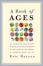
A Book of Ages
When Whitney Cookman was designing the cover of my book in 2007 I showed him several of my dot paintings. He liked this one and used it. It has an apt pointillism; the book is, after all, a 300 page accumulation of pointed anecdotes, unrelated but linked by the accident of being placed next to each other, having taken place in the same year-of-age. What plot the book sustains is invented in the readers mind. The stories are amusing and bite-sized, like the candy the cover art seems to suggest. The paperback edition, published today by Three Rivers Press, has a different cover with a bright orange balloon on it, not painted by me. The balloon is supposed to push the idea that A Book of Ages is a perfect birthday gift, and it is that. Subtlety doesn't usually sell a million copies. But I did like the candy-colored dots.


Monday, February 1, 2010
Palm with a Dry Brush
There is a texture you can only get with a dry brush. It's hell on the brush, but the effect is interesting and delicate. I think this would be an interesting image for the cover of a book. It's a palm tree viewed through parted curtains, at night. One of a series painted for gallery sale.


Friday, January 29, 2010
Stress
The article was about stress. Its sources didn't surprise me. How many people did they need to study to learn that medical diagnoses cause stress, or taxes, or bills, or bosses, or children that speak to you like Robert DeNiro in one of his mobster roles? My idea was to show an Everyman being hounded by all these things. This is what illustration does better than photography. A person photographed for this story would have looked confused or unhappy or maybe constipated. It appeared in the LA Times.


Thursday, January 28, 2010
Bagatelle no. 25
What do these mean? What do they suggest to you? And where was my head at when I began Bagatelle no. 1?
The first two in this series were painted for a gallery show in Florida that never came off. (The gallery folded the week I showed up for the opening.) Numbers 1 and 2 were in American Illustration a few years ago, but no design or ad work has come of it. The New Yorker asked me to do a series of these but never published them.
They are peculiar, allusive and vague. If they are "fine art" maybe I have no business doing them. Maybe they are the visual equivalent of my recent short stories, the ones that connect up but never answer the questions raised. These stories have been admired but, again, never published. If this category of work is a dead end it is at least an interesting and thoughtful one, but nobody these days pays people to think or suggest things they can't resolve neatly.

The first two in this series were painted for a gallery show in Florida that never came off. (The gallery folded the week I showed up for the opening.) Numbers 1 and 2 were in American Illustration a few years ago, but no design or ad work has come of it. The New Yorker asked me to do a series of these but never published them.
They are peculiar, allusive and vague. If they are "fine art" maybe I have no business doing them. Maybe they are the visual equivalent of my recent short stories, the ones that connect up but never answer the questions raised. These stories have been admired but, again, never published. If this category of work is a dead end it is at least an interesting and thoughtful one, but nobody these days pays people to think or suggest things they can't resolve neatly.

Wednesday, January 27, 2010
Restauranting
I did this illustration for Los Angeles magazine, art directed by the excellent David Armario. The story was about Musso & Franks, a Hollywood hangout that some say is haunted by the ghosts of the stars who once lunched there. Curious to know if you can identify any of these famous faces.


Tuesday, January 26, 2010
Inventing an Icon
The best iconic images are blunt. Simple. Realism is unhelpful, really. It's distracting. When I was working on this I'd recently been working on a series of gesture images, with a more painterly and realistic outline, so I took effort here to make the fist awkward. Awkward because protest isn't graceful or lovely, it's rough and tumble, but also because awkwardly drawn anatomies are more sincere somehow. Cimabue is more sincere than Raphael. Ben Shahn is less slick than Norman Rockwell or Andrew Wyeth. It's as if we see the imperfections in a rendering and feel the need to look past them for something more. It isn't a realistic diagram or rendering so it must mean something too. Realism is itself. Unrealism is more suggestive.


Friday, January 22, 2010
Underfoot
There are things a drawing can convey better than a photograph can. It's hard to photograph a feeling or an idea, an abstract relationship, a sense of oppression or liberation. Sure you can show the look on an individual face, and that's real, but even that is open to interpretation, relying on context or subtext for its meaning. A drawing can express something without explaining it. You nod your head without even knowing it.


Wednesday, January 20, 2010
Iconography
This is one of my favorites from the dot series. I love it because it is so meaningless, which is another way of saying it could mean anything. I do no sketches and study no reference for this kind of painting. I carefully paint the dots, then quickly add the icons. I can't be thinking of anything or looking at anything or trying to say anything, which sounds kind of like bullshit. I suppose it is. I'm curious to see what comes out of the brush when I'm not trying to draw anything in particular. If something concrete comes into my head I make sure it's painted upside down. This is called method. It's a variation on the method I use to paint bagatelles, a way of tricking the subconscious into committing itself to paper.


Tuesday, January 19, 2010
Kid's Books
Nice thing about a blog: you get the chance to show-and-tell stuff that you love, sometimes stuff that never materialized into a book or a product or an ad. This is one such. A fun concept, an idea pitched to me from someone's I-Phone in NY, drawn that evening, then we all went on to other ideas and forgot about it. My files are populated with orphans like this. Cute though.


Friday, January 15, 2010
Garden Angel
At this bleak time of year I try to think of the bulbs waiting underneath the snow. This is a sketchbook piece from several years ago, a fun experiment with collage. I did not clip the Gertrude Jekyll material out of one of my books, it's a xerox.


Thursday, January 14, 2010
Odalisque
I've found that you can employ some artistic formulas for almost any purpose. Art history is full of annunciations and crucifictions; we use those familar poses and gestures all the time, repurposing them for our momentary use. They bring their own subtext to a new set of characters. It is like those flip books where you switch the head of one person onto the body of another. When you think about it, this is the essence of comedy. Upsetting our expectations, rearranging our perceptions, moving the furniture, wearing the wrong hat or the wrong socks. In Hitchcock's films there are a dozen situations where the hero is forced to masquerade as something he is not, usually in front of an audience. It makes us nervous, but we laugh. I could write a funny story around this series of small bankers. What has cast him in the pose of an Odalisque, with his pear and his wine? Who is he consorting with? This and several other small banker drawings will appear in The Believer next month.


Wednesday, January 13, 2010
Small Banker
I drew this little man last year, and I thought to myself "He looks like he might be a banker." Expressionless, unmuscular, dressed in the proper uniform for denying credit to someone. A cold eye. Granted there are bankers out there who are wonderful human beings. Not him. This guy seemed to distill the essence of bankerness. I did a set of variations on him, in miniature, in a variety of poses and changes of costume, but always the same blank expression, like the face on an envelope containing a bill. I sent them to the magazine I usually send these small serial spots to, but answer came there none. So I sent them to Andrew at the Believer, who has always believed in me. And that's where they will appear next month. Watch for them.


Tuesday, January 12, 2010
The Bird
I sat down one morning and drew this. Don't know where the creature came from. Is it a bird or something else impersonating a bird? Why is it wearing a hat? How does the hat stay on when it flies? And how does it play that guitar with no fingers? These are questions the artist doesn't have to answer.


Thursday, January 7, 2010
When I'm Big
This is another image from my children's book WHEN I'M BIG. "When I'm big I won't need to use the bridge." The tunnel would probably present a problem too. Part of the distortion carries over into the perspective lines that don't match, the awkward modeling of the buildings. The paint application recalls when I was in elementary school and couldn't get enough paint on the brush to cover what I wanted to cover.


Wednesday, January 6, 2010
A New Year (and Thoughts Appertaining Thereto)
I did this art to accompany an essay I wrote for Leite's Culinaria, a tasty food website out of New York. I also used this dot style for my book cover. (See right) The gist and anecdotes of the essay came from the book as well. In essence: we eat and drink with people we know and love and we live another year. It's a survival behavior. I practice it religiously.

(A Book of Ages makes a lovely hostess gift)

(A Book of Ages makes a lovely hostess gift)
Tuesday, January 5, 2010
Happy New Year
I drew this in my sketchbook last year and sent it around to the usual suspects, art directors who have uses for zeitgeisty images like this. But the market for zeitgeist is very elastic and vulnerable to cycles. I sense a fragile optimism out there, but we know the man with the saw is lurking just behind us, and we wonder if the one small balloon will keep us aloft for very long.


Monday, January 4, 2010
HOLIDAY (happy)
To be less trite and a bit more offbeat, I decided to put "Holiday" on the cover and the "Happy" inside. Anyway, this was our holiday card this year. Beautifully letterpressed by the Cranky Pressman.


Wednesday, December 23, 2009
Suburbia: Winter
This time of year I cast my mind back over places like this. The places where I grew up. When I was living in those suburbias of low-slung ranch and split level houses I wished I lived in better surroundings. I preferred elm-lined streets of alternating colonial and Georgian and Tudor houses. Usually these neighborhoods were adjacent to country clubs. We were not country club people. Now I look at the suburban cul-de-sac aesthetic with more nostalgia. It is, after all, the world inhabited by Charlie Brown, who is about my own age. Charles Schulz created the Peanuts characters about a mile from here, in a Spanish Colonial along Minnehaha Parkway.


Tuesday, December 22, 2009

Monday, December 21, 2009
Mele Kalikimaka
I did this Santa on a surfboard for Town & Country. Apparently this is how Polynesian Santas arrive on Christmas morning.


Friday, December 18, 2009
Another Christmas Fairy
This is one of a whole slew of holiday sprites I did for Barney's a couple years ago.


Wednesday, December 16, 2009
A Snowy Street in Minneapolis
Funny, I can remember what I was listening to on the radio when I was drawing this. Thirty years ago I was in the Christmas card business, drawing, publishing, packaging and selling my own card line via department stores and gift shops. I can't remember where this street is though. Someplace in Kenwood, I think. Near Lake of the Isles. My parents still prefer my art from this period. I was a completely different artist then.


Tuesday, December 15, 2009
A Tin-Toy Santa
I've said that I like to paint toys, tin-toys especially. Usually the toys are completely invented, but I think this one might be real. Maybe a hybrid of more than one toy item. It's hard to make Santa interesting. It helps if you can transform him in some way, changing the color of his suit, or putting him in a different mode of transportation, a goat for instance. I sent this one out as a Christmas card one year.


Saturday, December 12, 2009
Reindeer Shopping
I did this reindeer as a holiday card for Graphique de France some years ago. Except for the antlers this is a self-portrait.


Thursday, December 10, 2009
The Geography of Christmas
I did this as a black and white map first. I published a black and white card line for several years, and still like doing plain, unelaborated line art. But Graphique de France asked me to do some cards for them and this was one that I thought would look good in color. I also did maps of London, Paris, New York, San Francisco and Los Angeles for them. The geography of Christmas required some invention. I especially like the town of Yes, Virginia. As in "Yes, Virginia, there is a Santa Claus." If any one is mystefied by anything I included, please ask. All details relate to something specific in the popular culture.


Toys Toys Toys
When I can't think what to ask for for Christmas I ask for toys. Tintoys, Dinky Cars, cast metal toy soldiers. Somewhere, in a drawer probably, I have a set of elastolin zoo animals I found at an estate sale years ago; I should find them and put them out. It's a toy time of year. I did this motorcyclist for a designer friend who likes motorcycles. I should maybe offer my services as a toy portraitist. Is there such a thing?


Wednesday, December 9, 2009
Carolers, Zebras, Thompson Gazelles
Another spot from that holiday issue of Town & Country. The story was about caroling at the zoo. (A hard thing to photograph.) I suppose exotic animals enjoy traditional carols as much as anyone.


Tuesday, December 8, 2009
Creche
I did this for Town & Country several years ago, and I can't remember if they used it or not. It may have been one of those sketches that didn't get picked but I liked enough to paint anyway.
I used to treat our living room manger scene like a toy theatre, arranging and rearranging the figures, enacting family dramas: "Why didn't the shepherds bring a gift?" "Why didn't you check ahead for a hotel room?" Etc. A godlike propensity I have shaken since.

I used to treat our living room manger scene like a toy theatre, arranging and rearranging the figures, enacting family dramas: "Why didn't the shepherds bring a gift?" "Why didn't you check ahead for a hotel room?" Etc. A godlike propensity I have shaken since.

Subscribe to:
Posts (Atom)

 Posts


