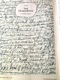
The first idea was to create a palimpsest of overlapping handwritten fragments, which I did several different ways. I liked the effect, but it seemed more like overlapping dialogue, like in an Altman movie, rather than a series of discrete fragments of private talk.
So I thought of something else, something I'd never tried before: inverting the lettering and shifting it into color and cutting and pasting it together. I'd do this in shapes rather than in strips. It's hard to do a sketch of a collage. It makes more sense to do the finished art right off, to see if it works. This is what I was doing. I'd gotten the call at the end of the week and promised sketches on Monday, planning instead to show several finished illustrations and see which they liked, reworking them as needed. This color illustration of bright lettering collaged together was invented as I was trying it out, and it worked pretty nicely. There was a bright Miro-ish playfulness to the shapes and the palette (including a certain amount of pale and gray colors made the other colors brighter and also helped echo the feel of the snowstorm in the story). The composition suggested one large voice balloon comprised of all these simultaneous conversations, all these relationships working themselves out in the air during this snowstorm. (I added snowflakes to this version too.)
This seemed perfect to me, but it didn't resemble the style sample Awan had liked initially, an overlapping diagram in two tones of blue that I'd sent him a few months ago. I went to bed loving the bright collage I'd done, but half of my mind thinking of how I might create something more in the style he'd suggested. Next day I rewrote the bits of dialogue and inserted them into voice balloons, shifting the line into the two blue tones from the style sample he'd liked, and assembled them on top of the earlier palimpsest that I'd also shifted into cool wintry blue shades. Then I inserted a semi transparent layer behind the voice balloons to help them show up better.
This is the one that ran in the magazine this week. Awan had the clever idea of inserting the story's title into a voice balloon in the middle of the page. Brilliant touch.
When it came in the mail my wife said "After years of submitting your stories to them, you can finally say you've had your writing published in the New Yorker." (She's much wittier than I am.)


