
Friday, July 23, 2010
Ball Games
Heading into another summer weekend, I am remembering the games played many years ago, chiefly whiffleball. Basketball was played earlier in the year in our neighborhood, soccer later, football in the fall, winter was spent at the ski hill down the street. Whiffleball was perfect because it didn't require full teams or large yards. Baseball was organized; there were coaches who yelled at you, and umpires who called you out. Whiffleball was played with a ball that was lighter than air. It was disorganized, freeform, games usually broke up over disputed plays, making it a perfect reflection of childhood's dynamics. I did this illustration for an article in the Atlantic about a serious grown-up whiffleball league in Florida. Grownups always find ways of killing the joy of the game. I did my best not to flatter the athletes. Note the cleavage on the player in the middle.


Thursday, July 22, 2010
Saxophonic
Another card from that deck created by Lisa Catalone. Simple line + bold, slightly offset color. She typeset from a font she and I created. Wonderful, really. (If I were a designer I'd know how to scan the printed piece minus the strobe effect.)


Wednesday, July 21, 2010
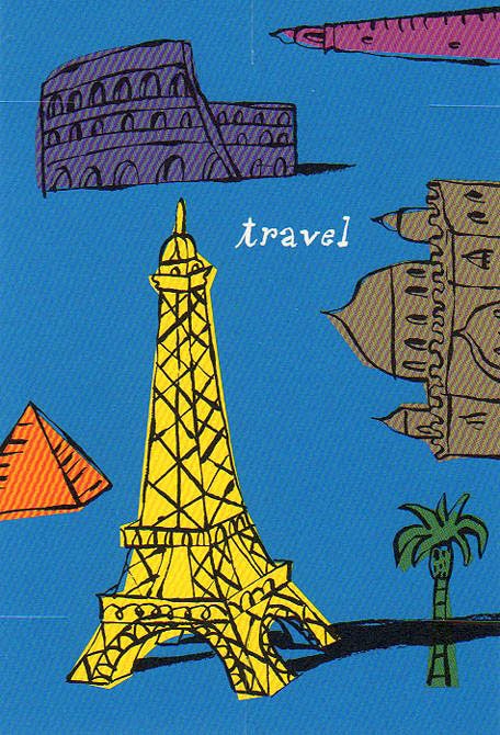
Travel
I've been in the travel business all my professional life, as a mapmaker and travel writer, but also trading in the iconography of places. When you think of a place what do you see? What is the single piece of architecture or landscape that serves as a marker? When I am doing an illustrated map it's these items that I arrange on it, like furniture, or photographs set on a piano. India=the Taj Mahal. Paris=the Eiffel Tower. Egypt=Pyramids. Etc. Tourist shorthand, but useful. This card was designed by Lisa Catalone.

Tuesday, July 20, 2010
Celebrations
The household chore I enjoy most is that of resident artist. I am the one who draws cards for friends and family, cousins, in-laws, aunts, for birthdays, anniversaries, graduations, bar mitzvahs. I get to be my own art director––and tend to be pretty demanding. This was the second idea I painted for the occasion yesterday, and much better than the first one.


Monday, July 19, 2010
A Campus Map
Maps are usually contained inside rectangles, and over the years I've become adept at decorating those rectangles, but once in a while a map is needed for an odd shape. It's fun when this happens. It's especially challenging when the shape doesn't match the landscape being set into it. Distortion is a useful tool, one mapmakers use all the time; after all our continents are inscribed on a globe, not a flat sheet. Catalone Design needed a map to go on the inside of a fold-out box designed to contain Q&A cards. I thought it was interesting that the shape is cruciform; the client was a Jesuit school. There is a bit of Ludwig Bemelmans and Abe Birnbaum in the handling of the buildings and the patterning in the trees. A nice piece altogether, thanks to the art direction of Lisa Catalone.


Tuesday, July 6, 2010

Wednesday, June 30, 2010

Tuesday, June 29, 2010

Friday, June 25, 2010
Cafe Society
Friday afternoons in the summer should be spent at a sidewalk table. I did this illustration several years ago for the Philadelphia Inquirer, art directed by Sue Syrnick. It was included in the American Illustration annual for that year.


Thursday, June 24, 2010
A Father, A Son and a Boat
I did this illustration for one of Nickelodeon's magazines. I think the boy might be imagining himself as George Washington.


Tuesday, June 22, 2010
Big Hair
I did a series of drawings about hair for the New Yorker, never used. But the extravagances conjured up were a lot of fun. I also wrote a picture book along the same lines. Children love exaggeration. Unfortunately, very few of them are editors. This drawing appeared in American Illustration.


Sunday, June 20, 2010

Thursday, June 17, 2010
World Football

There is something atavistic about football. I refer to the world game, what we call soccer, from a strange elision of the words "association football." Watched from high above as commentators do it seems sublime and geometric. Up close it is both more vicious and more elegant. When I was writing about it I disliked the detachment of the press box (free food and drinks notwithstanding) and always watched from ground level, where I could feel the atmosphere and hear the verbal abuse. Otherwise personable chaps became something different on the field, willing to destroy and (worse) embarrass their opponents. And afterwards they'd be chums again, ordinary blokes like someone you might see working in a bank.
Tuesday, June 15, 2010
The American Pasttime
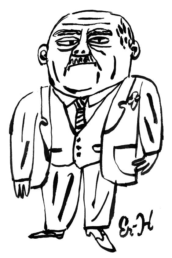
This ballplayer appeared in my sketchbook a couple of years ago. He's a bygone figure (note the baggy knickers.) His muscles are the kind you get hauling ice or baling hay, not from a syringe. He is a Honus Wagner type. With all the imaginative names in baseball it's surprising there isn't anyone named Honus playing today. I am going to see the Twins play tonight in their new outdoor stadium. I attended the last game at the old Met Stadium; a very cold football game. My son wishes I had torn out my seat and taken it home.


Monday, June 14, 2010
The World Cup
Half a lifetime ago I spent a lot of my time contemplating the game the rest of the world knows as football. I was writing for an alternative weekly, covering the elderly World Cup players who were spending their retirement in the NASL, which is how I got to interview Pelé and Beckenbauer, along with some second-rate but very amusing English players. All of these players were infinitely better than anyone America could produce at the time. One thing I learned is that soccer, or football, is an endless source of explanations for how the world functions. Somebody wrote a recent book along those lines, something I never got around to. But the metaphors are just as useful to an illustrator. Politics and business and other forms of global conflict take their form from the original ball game. I did this illustration for an insurance magazine.


Thursday, June 10, 2010

Wednesday, June 9, 2010
Real Baseball
I did this drawing for Harper's a few years ago. It's one of a series I drew of baseball players. (When I drew this I was visualizing Juan Marichal.) Sports belong to photographers, but I think a line drawing captures the essence better. Athletes are as elegant and interesting to draw as ballet, but except for horse racing Degas wasn't much of a sports fan and I don't think Rembrandt ever played or watched anything. I am thinking about doing a sketchbook of soccer players to celebrate the World Cup. Soccer was the game I played and wrote about for quite a few years.


Tuesday, June 8, 2010
A Story Following a Road
I began this story on a two lane blacktop road in the countryside and followed it through exurbia, varieties of suburbia, into the city. There is no narrative other than the path itself. There are digressions, side streets that rejoin the main thoroughfare. There are places where the road disappears momentarily around or over or down a hill or into a tunnel. Some of the neighborhoods traversed are warrens of interesting loops and cul de sacs. Some are grittier, some rather posh. Where it will wind up I am not entirely sure. Maybe that is the point of the best kinds of adventures. One editor friend suggested I add some written narrative. I wonder if that would undermine it. Maybe a commentary track? This is essentially a silent film, but one without gags, without title cards. So far, anyway, it hasn't needed them.


Wednesday, June 2, 2010
Swan, Champagne, Caviar
I did this illustration for the LA Times. The columnist was describing the kind of perfect Mother's Day he orchestrated in their house.


Friday, May 28, 2010

Wednesday, May 26, 2010
Call the Caterer
Between grad parties and wedding parties, this is the time of year to be a caterer. I've done a lot of food images over the years, for all of the food and shelter and city magazines. It isn't a matter of point and shoot; I have to re-imagine the food or the scenario. I re-imagined this pastry chef as a piece of Staffordshire pottery. Colorful, simple, sweet. I think I painted this for Town & Country.


Tuesday, May 25, 2010
An American Icon

I cropped this head of Paul Bunyan from a tourism brochure and drew the dog and his dinner underneath it. At the time it seemed humorously incongruous; now it seems apt. The newest shouts of individualism are being paid for by large corporate entities who'd rather have obedient people working for them. Some Americans behave in a way Pavlov would be able to explain.
Thursday, May 20, 2010
Airplanes, etc.

My parents once expressed hopes that I'd find a job in the airline business, so they could fly for free. A very sensible idea. The closest I've come is doing art for airline advertising. Fifteen years ago I did a daily ad for one airline. This week I've been doing some paintings for another. As a mapmaker, it's a good fit. But illustrators seldom are flown anywhere on assignment. I get to go places more often as a travel writer. I used to fly all over to write about ski destinations, but since I no longer ski I am looking for a different gig. Beaches maybe, or cities with interesting cafés. I once introduced myself as the food and wine editor for Skiing magazine. I could do the same for another magazine if asked.
Wednesday, May 19, 2010

Monday, May 17, 2010
Making the Grade
I did this illustration for a Time magazine article about grade inflation. The metaphor of the ladder works two ways because an A is also a ladder to success. But not all A's are created equal. Some teachers are kinder than others, some schools engineer grade points, and some students get a leg-up for very good reasons. I'm grateful for every leg-up I got. I know it was easier in my day. Competition for grades has become overheated. I can't remember if there was anything about learning in the article, but learning has become less important than the score. Things we learn under this kind of pressure tend to be forgotten quickly.


Tuesday, May 11, 2010
Another Choice Drawing
This is another drawing I did for the New York Times op-ed piece about school choice last week.


Friday, May 7, 2010
Suburbia Illustrated
I grew up in suburbia. (Pause to allow murmur of shock and opprobrium to subside.) I hasten to add that it was different then. Less privileged, more innocent, and considerably smaller. My sketchbooks since then contain suburban imagery as a kind of leitmotif, a journey with destination, the destination being either the countryside or the city. The city neighborhood I live in today resembles a suburb of two or three generations ago, which may be why I love it. Houses midcentury and older. (Ours is circa 1900 and was built as a lake cottage.) This drawing is part of a series I've been working on for some time for an editor of children's books at Farrar Straus. Maybe I'm trying to rediscover my childhood. It's what we all do. If I can I'd like to describe those remembered voyages by car, preferably without text because the drawings are the story. One page will leave off where the next one picks up and the child will follow along with his finger, scrutinizing, as I did, the variety of domestic landscapes along the way.


Tuesday, May 4, 2010

Thursday, April 29, 2010
Absolutely Meaningless
Just a drawing, nothing more. Sometimes the arrangement of shapes and details gives me an idea for another drawing. I did get an idea this morning from this but plan to let it sit for a while, look at it and think about it and come back to it later.


Wednesday, April 28, 2010
Which Way Forward?
My eighteen year-old son is at one of those crossroads. I'd be surprised if he ended up on Wall Street, but it is one of the signposts. I did this illustration for Macalester College's magazine. Brian Donahue art directed.


Tuesday, April 27, 2010
Collage
I was working in collage last week for a magazine in California. The topic was dance in various spiritual or picturesque settings around the world. Here is one early version of the art. The usual sketch-approval process doesn't work the same for collage. You have to find the elements before you can pitch them, which puts the artist and the art director out on a limb. But often the results can be wonderful and evocative in ways simple painted illustration is not.


Friday, April 23, 2010
Household Planets
This is how it feels sometimes. Each of us moving in our own orbits, concentric and eccentric, occasionally colliding.


Tuesday, April 20, 2010
Global Dance
I did this sketch last week. We ended up going in a different direction but I rather liked this.


Monday, April 19, 2010
Hair Topiary
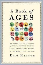
With hair topiary I may have invented a new style, a new vogue. Time will tell. For a few years I have been working on a series about hair. I wrote a children's story about hair. In A BOOK OF AGES it forms a leitmotif––when Hitler grew his moustache, when Steve Martin went gray, when Darwin grew his beard, when Hemingway's turned white like Santa Claus's. When he was a child Mike Nichols lost all his hair because of a short, acute illness, including his eyebrows; he's had eyebrow toupees throughout adulthood. I do not go into the topic of merkins, but perhaps that is next.


Friday, April 16, 2010
Vox India
This was one of the first op-ed images I did for the New York Times. The art director then was Nicholas Blechman. The piece, as I recall, was about the difficulty of picking a language to use to address the polyglot Indian public. The building depicted is the Red Fort in Delhi. (I'm a little preoccupied with India at the moment because I am reading The Siege of Krishnapur by J. G. Farrell.)


Thursday, April 15, 2010
Houseness
There is a quality I call "houseness," part of the larger rubric called "thingness." I can remember drawing houses when I was four and all the other kindergarteners drew their chimneys at a right angle to the roof instead of vertical. I felt quietly superior. I also made a special point of always including garbage cans and shrubbery next to the house, and telephone poles. This additional detail made it hard to include my full signature and I began signing my work Er-H.


Wednesday, April 14, 2010
A Cover I Did for New York Review Books
I got a box of beautiful books in the mail yesterday. (My favorite packages contain books.) I painted the cover of this one for NYRB last fall. A fun classic long out of print. Louise Fili art directed. When I'm having fun with a project sometimes I'll go ahead and paint the concepts we didn't pick. They were all fun to do. I posted a couple of them earlier this year, here and here. But I liked this one best. It's a very entertaining read. The sort of book I can imagine grandparents reading to their grandkids.


Tuesday, April 13, 2010
Cartography and Beer
I did this map a few weeks ago for the Washington Post. It did not require traveling to all of the places noted or drinking all of the beers. (And, yes, I realize that Europe and America are not this close together, Europe is not this large, and Africa and South America do not overlap.)


Monday, April 12, 2010
Perfect Pitch
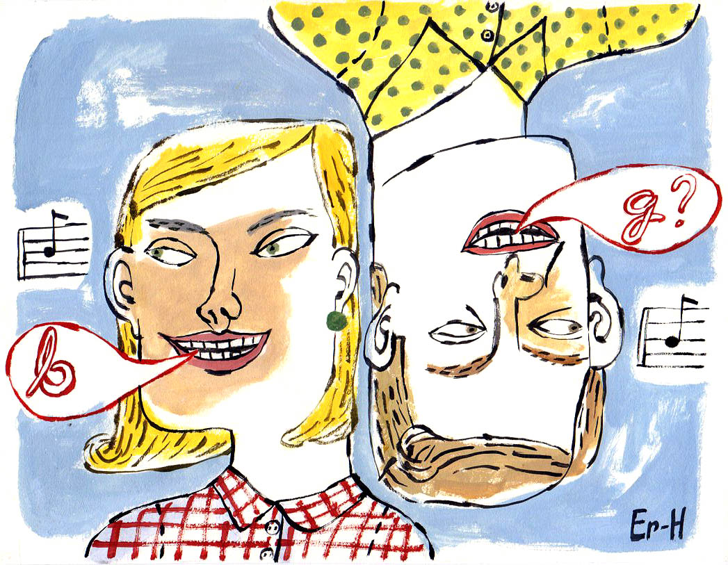
The subject was "perfect pitch." There are few concepts as unvisual as music is. You can draw a violin, but a singer needs a musical note inside a voice balloon to establish that she isn't a dental patient. But how do you illustrate the idea beyond that? Perfect pitch is an instinct that goes beyond simple comprehension. I inverted the other singer to suggest that two people might imagine the same note differently. I underlined this by inverting the B into a G. To get to the abstractness of it, the subjectiveness of it, I needed to employ a more distorted line, more Max Beckmanish. The awkwardness of distorted figures forces the viewer to make sense of it rather than simply absorbing the obvious content. Glib cartoonishness would be too simple, too smooth for that. Inversion is a neat device I've used before. I did this for the Hartford Courant, under the able art direction of Melanie Shaffer.

Friday, April 9, 2010
Are We Happier?
I did this illustration for a story about property and happiness. I"m the person on the left.


Thursday, April 8, 2010
All Revolutions Burn Books
In the case of the digital revolution is the fire only virtual fire? I own books where you can actually feel the imprint of the type on the page. Ninety percent of readers under 30 will not know what that means or care. So, in a way, the Fahrenheit 451 scenario I described in the illustration has come true. Even the size of the machine is quaint and antique. While this revolution was taking place I was describing it almost weekly in magazines like Time and USNews and Technology Review, trying to keep up with the hardware, inventing new iconography and metaphors and shorthand for what was happening.


Wednesday, April 7, 2010
Hard Choices
There was a time when our hardest choice was whether to spend more time in Florence or Venice on a trip to Italy. It's easier to show this in an illustration than a photograph. Photo reality makes this kind of metaphysical comparison seem implausible, but this is exactly how close Venice and Florence are inside our heads. (That is Florence on the left.)


Tuesday, April 6, 2010
The Loafer
I notice that Lisa Birnbach and Chip Kidd are reviving a very useful anthropological study of Waspus Preppicus. Until I read it back in the 1980s I only knew chinos and loafers as my native costume, not understanding the class implications. I'd never visited the holy sites on Martha's Vineyard or in Westchester. I had gone to summer camp with children from Lake Forest and Winnetka but didn't at the time understand the sound basis for their scorn. I was like Nick Carraway. (As I've noted elsewhere, I went to the same college as the arriviste's arriviste, Jay Gatsby, though we never met, being from different decades.) Anyway, the Preppie Handbook opened my eyes. I still prefer chinos and I wear only loafers, always without socks. I have not worn socks with loafers since the late 1970s.


Monday, April 5, 2010
You Tell Me
When I see patterns in nature I jot them down. Over the years I've stored up a disorganized but useful lexicon of items and shapes. A taxonomy of sorts. European ships that went out to exploit and colonize the world in the 18th century sent botanists along to collect plants for botanical gardens and zoologists to collect animals for zoos. These chaps in pith helmets organized their collections by resemblances and it's also how we organize our thoughts. There doesn't need to be an end in mind. Doodling is a kind of pure research. What does this drawing mean? I don't know.

Friday, April 2, 2010
A Road Looking for a Story

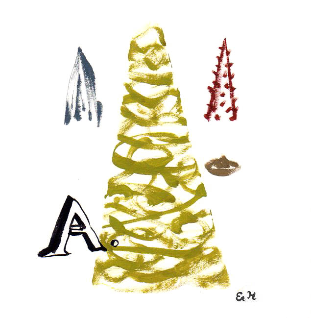
Someday I'd like to publish a book without text. Just a car on a road going somewhere. Side roads branching off, towns on the edge of sight, farms and yards obscured by trees, houses lived in by invisible people you'll never know. When I was young I found the side roads intriguing, but rarely did we turn down one. Other people knew where we were going but I didn't and didn't have any control over any of it. Life looks like this to a child, so maybe a book like this would be too much like their life, confirming all their existential worries.

Thursday, April 1, 2010
Hard to Imagine
Illustrators are supposed to describe things. But the most important art we do is of things that are hard to imagine, much less describe. Things as they aren't, things as they would be if only. To get to that description I need to forget the rules I learned since age five. The probabilities and proportionalities. The first thing I jettison is perspective, because that absence immediately tells the eye we are in a different place, that anything could be true. I try to unremember style and fluid line and facility, to get back to how I drew before I learned how. That is where metaphor and satire become plausible. It's a subversive process. This is another illustration from a children's book I hope to find a publisher for someday, if I can find one as subversive as I am.


Wednesday, March 31, 2010
Alphabetismo
Much of illustration is making one thing look like something else. I see resemblances everywhere, and letterforms are so deeply imprinted it's no surprise that I see them in everyday things. To make a lettered title more interesting I'll sometimes substitute a thing for a letter, a palm tree for a T, a teepee for an A, in rebus-fashion. Turning men into semaphores is a challenge.


Tuesday, March 30, 2010
Rural Landscape
I did this for my favorite aunt yesterday. Since I was a kid I've been a deep observer of the rural landscape. I've depicted it with small penwork and fat brushstrokes, fine and loose black line and more recently with pencil. I am not immune to influences. Edward Bawden, Eric Ravillious, Thomas Hart Benton, Wanda Gag, Garth Williams, Andrew Wyeth and others. This one is a bit more Matisse than Currie or Grant Wood.


Subscribe to:
Posts (Atom)

 Posts
Posts


