
Showing posts with label design. Show all posts
Showing posts with label design. Show all posts
Monday, July 23, 2012
Orientation, a book of stories
Here is the paperback cover of ORIENTATION, an intriguing book of stories by Dan Orozco. I did the lettering right down to the Faber colophon. Art directed by the wonderful Charlotte Strick. It was Charlotte's idea to throw a bright yellow behind these faces. Now the book practically jumps off the shelf. Brilliant.


Friday, April 29, 2011
Pretty Nice Company

It's flattering to be included with all these book cover heroes in this new collection from AltitudeSF. I owe much to the art direction of Susan Mitchell and Mr. Waters.
Wednesday, July 21, 2010
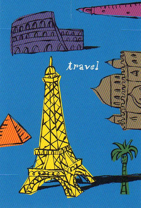
Travel
I've been in the travel business all my professional life, as a mapmaker and travel writer, but also trading in the iconography of places. When you think of a place what do you see? What is the single piece of architecture or landscape that serves as a marker? When I am doing an illustrated map it's these items that I arrange on it, like furniture, or photographs set on a piano. India=the Taj Mahal. Paris=the Eiffel Tower. Egypt=Pyramids. Etc. Tourist shorthand, but useful. This card was designed by Lisa Catalone.

Monday, July 19, 2010
A Campus Map
Maps are usually contained inside rectangles, and over the years I've become adept at decorating those rectangles, but once in a while a map is needed for an odd shape. It's fun when this happens. It's especially challenging when the shape doesn't match the landscape being set into it. Distortion is a useful tool, one mapmakers use all the time; after all our continents are inscribed on a globe, not a flat sheet. Catalone Design needed a map to go on the inside of a fold-out box designed to contain Q&A cards. I thought it was interesting that the shape is cruciform; the client was a Jesuit school. There is a bit of Ludwig Bemelmans and Abe Birnbaum in the handling of the buildings and the patterning in the trees. A nice piece altogether, thanks to the art direction of Lisa Catalone.


Wednesday, March 3, 2010
Purely Decorative
In our everyday lives there's no burning need for decorative borders, but they're nice. They're usually there for a reason. The elaborate baseboards at the foot of interior walls were put there to keep the mop from dinging the plaster. The leather hem on a car coat keeps the sleeve from fraying. In fashion, in the built landscape, in graphics, minor extras usually have a practical reason. Making them look nice is just a courtesy, which may be why designers are so polite. I did these decorative borders for Lisa Catalone, who was designing a neat mailer for a school back east. Besides the useful illustrations, I did lettering that she turned into a font, and these decorative borders which she used to make the individual cards look special, which is what made people linger over them and read what they said.


Friday, September 18, 2009
Red Hat, Old Cat
The guy in the hat was a sketchbook piece, the old gardener was a character in a children's book I was writing. Sharon Werner put them together into this promo, wrote the rhyming copy, inserted the commas, and voila. Good design makes interesting art more clever. The old guy isn't glamorous, but the color and texture are, and the context is sophisticated. The children's book remains unpublished, but I got some nice jobs out of this promo, some of them pretty glamorous.


Thursday, August 20, 2009
Working Small

Business cards are a cool item. I did these drawings for a restaurant web directory founded by some friends of mine. The friends had the taste and judgment to hire SPUNK do do the design, and the design is the hero of the piece. Good design always makes art look exponentially better. Good design makes me seem like the kind of artist who works in a cool studio suite of 50s modern design with refurbished steelcase and Swedish furniture in a hip warehousy neighborhood. I actually do most of my work at an old kitchen table looking out at a leafy neighborhood view, resisting the urge to walk down to the lake. My inspiration for this art came from watching too many Tex Avery cartoons.
Subscribe to:
Posts (Atom)

 Posts
Posts


