The op-ed I was asked to illustrate in the LATimes was about how the Supreme Court was being endangered by extreme partisanship.
The trick with art like this is to avoid false equivalencies. I happen to think it's not a good idea to put hardline political operatives on the high court. I don't think it's wise to elevate an alleged sexual predator to the Supreme Court. I also think Americans might distrust a justice who has difficulties with telling the truth and seems skilled at hiding it. Call me old-fashioned...
So...here is the finished art. It isn't as sharp as I'd wanted to make it. False equivalency standards require both sides be pilloried or neither, which often tends to undermine the point. This art ended up blaming neither party for this episode. In my opinion the old American principle of "majority rules" was exercised by the Republican majority (to take a hypothetical example) as two men might force their wishes upon a 15 year-old girl in a locked bedroom.
Or is that too hypothetical? Certainly no self-respecting elephant would act that way.
Showing posts with label visual metaphor. Show all posts
Tuesday, October 9, 2018
Monday, October 1, 2018
Another Visual Metaphor––When Is Something Really Something Else?
I watched a documentary recently called California Typewriter and found myself drawing typewriters for a few days afterwards. This was one of the ideas that popped up. I never owned a Selectric but always found the orb-shaped cartridge interesting. It seemed illogical (the gyrations required seemed overly elaborate)––but in use it proved very logical. It squeezed a complex sorting of letters into a very compact package, the most elegant of compact packages, the orb. It functioned in spite of itself. Sort of like the weird idea FedEx had of sending packages from New York to New Rochelle via Memphis. The central clearing house idea. It seemed cockeyed until it simplified the process.
Metaphors, likewise, emerge from concepts that seem odd or anomalous. Relations that seem remote that turn out to be direct. This is what analogies and similes are. Useful shorthand that forces the mind to make sense of something odd, a process which makes the idea seem absolutely right and commonplace. The obvious choice isn't always the best choice. (The shortest path between NY and New Rochelle might actually be Memphis.)
This is the key difference between direct representative illustration and metaphorical, idea-based illustration. A drawn metaphor works best if it remains simple, even blunt or crudely rendered. Not obvious or explicit. The more it looks like the image drawn the less likely it will suggest the idea or thing it's being compared to.
This drawing (above) would be a more successful metaphor if the Selectric orb were dropped into a planetary system, if it were revolving around the sun, for instance, or if it were being passed from player to player like a basketball. That said, I like the oddity of this running figure. I don't know what it means. That is what sketchbooks are for. For now I'm storing that drawing of the Selectric orb in this collage and may use it elsewhere someday.
Monday, February 27, 2017
Leap Into 2017
Having been a ski writer for 20 years I thought this was a perfect metaphor for what they wanted to say. (Be bold and don't look down.)
Friday, February 24, 2017
Money Metaphor
Wednesday, July 13, 2016
Another Drawing for the New York Times Editorial Page
I've been in the rotation this week doing some editorial illustrations for the Times. This editorial was about the secret rules that govern drone targeting and killing of terror suspects. Art director Sarah Williamson suggested the camouflage idea, and I thought of the idea of a curtain being drawn aside to reveal what is going on.
Drawing the drone and the hands and the missile were straightforward enough, but camouflage is harder than you think. It adds visual noise and pattern, and I tend to prefer simplicity, but keeping the palette narrow helped minimize the complexity. Making the hand match the brown tone in the pattern helped tie the image together.
Tuesday, July 12, 2016
A Drawing for the New York Times Opinion Page
The Times needs an image to work both as a vertical and a horizontal for its print and online editions.
The first drawing I did showed Hillary from the side. Because the Times avoids likeness (and satirical caricature) I drew her hair and her outfit, which instantly identify her. In this version I shifted the Hillary figure into a gray tone.
Tuesday, November 29, 2011
The Balancing Act

I did this illustration several months ago for the Cornell Law School magazine, art directed by Robin Awes. The topic was the difficult balance between philosophy and pragmatism. It's something encountered in law and politics but also in everyday life, in our work, even something as trivial as drawing pictures. We're always being asked to find a balance between ideal and practical, between good and bad or perfect and less perfect. What happens when the client's idea of perfect is different than our own? I used the monkeywrench to depict the practical and a Greek column to stand in for the philosophical ideal. Notice that the Greek column is a fragment from a ruin. Even the perfect isn't perfect.
When I taught professional practice at the College of Art & Design I had a lecture about another kind of balancing act. I asked my students, who were a couple months from entering the professional world: "What qualities make a successful illustrator?" We compiled two lists, one under the heading GENIUS, the other under RELIABLE. It's the same tension between practical and ideal. Work is a matter of negotiating a balance between the two...with an emphasis on the practical side.
Thursday, November 17, 2011
What's On Your Mind, Part II

I have an exercise I do sometimes, to get my brain moving, to get the ideas from my head to my hand to my pencil. I draw a face. I draw an oval, or I draw the arrangement of features. Why are they always arranged the same, like a place setting? There's no law about that, so I rearrange the furniture, put the ear where the nose usually is, or insert a spoon or an automobile in its place. What is it saying to me? Usually nothing, but it opens a door to resemblances that we train ourselves to ignore. Rule-breaking is the first rule of art. The world isn't two dimensional but the paper is. The offbeat equations we make don't need to be outright surreal to be interesting. The brain is who we are, so why not draw it into that space? Is he asleep, or thinking, or dead? Sometimes the best drawing is inconclusive.
Wednesday, November 16, 2011
Pencil Line is Thought on Paper

I find that the simplest line usually conveys the most. If I'm trying to create a visual metaphor (a metaphor uses a concrete thing to embody something else, a concept or an abstraction) it's best to leave it unelaborated. The less specific detail the better. In this case the shape of the head becomes a kind of Venn Diagram. A more detailed drawing would beg for explanation: what's that other head doing there? In this simple context it justifies itself. Our eye explains it for us.
Monday, November 14, 2011
How Do You Draw Music?

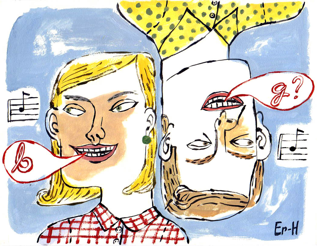
I did this illustration for the Hartford Courant several years ago. Coming across it again reminded me how hard it is to visualize some things, like music or things heard and not seen. We resort to shorthand and code to explain music, which is what I did here. The story was about perfect pitch, who has it and who doesn't. Having it is easier to show than not having it. (It's hard to show something that's not there.)
After sketching around the idea for a while I decided to put one person right side up and the other upside down, to show they are hearing the same music differently. I had them identifying the musical pitch differently. Not just differently, though. What she identifies as "b" he says is "g" which works nicely because it's "b" upside down. Some things are simple to show but complicated to explain.
Friday, June 3, 2011
The Corporate Ladder
Sometimes metaphors invent themselves. You dream them, or daydream them, putting them together out of puns and wordplay. I did a series of drawings beginning with the little walk we do with our fingers. This drawing grew out of that. I'm not sure what it means. Is it the corporate ladder? Or is it life's ladder, a kind of Jacob's ladder that ends who knows where? Tops of ladders always seem dangerous to me.
Tuesday, March 22, 2011
Grade Inflation
I did this illustration for a Time magazine article about grade inflation, a fashionable topic at the time. What's interesting to me, and I don't hear it discussed at all, is how much smarter our kids are than we were. Since business metrics were applied to public schools during the Reagan years, and we began requiring test scores to climb by X amount per year, and Y amount per dollar expended, I calculate that our children's brains have grown to around 2 1/2 times larger and 5 or 6 times faster than ours were at their ages. So maybe grades haven't inflated enough.
Thursday, January 20, 2011
Lightbulb Earth
Friday, January 14, 2011
The Politics of Tea
I wrote a little bit about the original Boston Tea Party in my book. Those hooligans were as ragtag as the current ones. They too were worked up about politics outside their control; then it was about overseas trade more than taxes to fund social programs. (There were no social programs then.) Today's tea partiers have legitimate fears, fears that many of us share. It's the way those fears are being channeled that should worry us. Also in my book is the story about John Adams, a young lawyer, who in the aftermath of the Boston Massacre, undertook the legal defense of the British soldiers charged with murder. Today he would be hung in effigy. Our early democracy was more complex and open-minded than many of today's so-called "patriots" would like to believe.
Tuesday, November 2, 2010
Tea Party Politics
This is one of three sketches I did for a New York Times editorial page assignment. The topic was the Tea Party. They went with the simpler one of the hand holding a ballot, but I liked this one best. I probably should have included a few dollar signs in the voice balloon, since the Tea Party was organized and funded by two secretive New York oil billionaires.
Tuesday, July 6, 2010
Monday, April 12, 2010
Perfect Pitch
The subject was "perfect pitch." There are few concepts as unvisual as music is. You can draw a violin, but a singer needs a musical note inside a voice balloon to establish that she isn't a dental patient. But how do you illustrate the idea beyond that? Perfect pitch is an instinct that goes beyond simple comprehension. I inverted the other singer to suggest that two people might imagine the same note differently. I underlined this by inverting the B into a G. To get to the abstractness of it, the subjectiveness of it, I needed to employ a more distorted line, more Max Beckmanish. The awkwardness of distorted figures forces the viewer to make sense of it rather than simply absorbing the obvious content. Glib cartoonishness would be too simple, too smooth for that. Inversion is a neat device I've used before. I did this for the Hartford Courant, under the able art direction of Melanie Shaffer.
Wednesday, April 7, 2010
Hard Choices
There was a time when our hardest choice was whether to spend more time in Florence or Venice on a trip to Italy. It's easier to show this in an illustration than a photograph. Photo reality makes this kind of metaphysical comparison seem implausible, but this is exactly how close Venice and Florence are inside our heads. (That is Florence on the left.)
Monday, April 5, 2010
You Tell Me
When I see patterns in nature I jot them down. Over the years I've stored up a disorganized but useful lexicon of items and shapes. A taxonomy of sorts. European ships that went out to exploit and colonize the world in the 18th century sent botanists along to collect plants for botanical gardens and zoologists to collect animals for zoos. These chaps in pith helmets organized their collections by resemblances and it's also how we organize our thoughts. There doesn't need to be an end in mind. Doodling is a kind of pure research. What does this drawing mean? I don't know.
Thursday, January 28, 2010
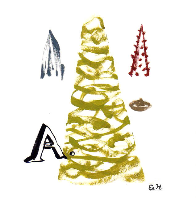
Bagatelle no. 25
What do these mean? What do they suggest to you? And where was my head at when I began Bagatelle no. 1?
The first two in this series were painted for a gallery show in Florida that never came off. (The gallery folded the week I showed up for the opening.) Numbers 1 and 2 were in American Illustration a few years ago, but no design or ad work has come of it. The New Yorker asked me to do a series of these but never published them.
They are peculiar, allusive and vague. If they are "fine art" maybe I have no business doing them. Maybe they are the visual equivalent of my recent short stories, the ones that connect up but never answer the questions raised. These stories have been admired but, again, never published. If this category of work is a dead end it is at least an interesting and thoughtful one, but nobody these days pays people to think or suggest things they can't resolve neatly.
The first two in this series were painted for a gallery show in Florida that never came off. (The gallery folded the week I showed up for the opening.) Numbers 1 and 2 were in American Illustration a few years ago, but no design or ad work has come of it. The New Yorker asked me to do a series of these but never published them.
They are peculiar, allusive and vague. If they are "fine art" maybe I have no business doing them. Maybe they are the visual equivalent of my recent short stories, the ones that connect up but never answer the questions raised. These stories have been admired but, again, never published. If this category of work is a dead end it is at least an interesting and thoughtful one, but nobody these days pays people to think or suggest things they can't resolve neatly.
Subscribe to:
Posts (Atom)