Thursday, March 7, 2013

How Not To Cut

I woke up Monday morning to an assignment from the NYTimes. One of those neat little drawings that draw the reader's eye to the letters on the editorial page. Maybe this is why they are called drawings.

The subject was the one on everyone's mind: the draconian sequester cuts––it's unusual when two of the three words describing the issue of the day are words nobody uses much and most people couldn't define for you. We have half the country enthused (to the point where they should maybe go lie down) about cutting federal spending. What's interesting is the people most rabid about cutting are the ones whose lives and whose districts would be most negatively affected. Here's where we enter the realm of unintended consequences. ("Honestly, doctor, I didn't realize I shouldn't cut that branch closer to the trunk than the point where I was sitting on it.") It's the Red Districts that receive most of the federal dollars and they also, conveniently, pay less in taxes than they receive. There is a Snopesian cleverness about this which I almost admire. But it is hard to squeeze all of these thoughts into a drawing the size of your thumb. So, as always happens, I resorted to metaphor. And there is actually a thumb in the metaphor, although it isn't the thumb which the budget cutter is about to sever.
Point is, we don't always think about deeds and consequences. Sometimes wars cost money. Sometimes poisoning the air winds up poisoning the people who breathe it. Sometimes cutting federal spending during a severe economic downturn ends up cutting the only spending that's happening. At which point the economy begins to lose any semblance of a pulse.

Republicans and rich people like to give advice to the poor about thrift, but only poor people know thrift.  They are experts at it. The Republican gasbags (there are Dem gasbags too) like to preach the morality of spending cuts "to save our children". They preach austerity while driving large cars and owning twelve homes. Forcing austerity measures on an economy during a recession is like starving your children to protect their inheritance. Which sounds stupid, but to rich people it's actually smart, because after the children of the poor starve, their money carefully unspent will remain in banks where the rich can go on playing with it. I enjoy drawing pictures describing damnfoolishness like this.

(I would like to thank Ben Shahn and Ludwig Bemelmans and a few others who taught me how to draw hands and papercutters.)

Monday, February 18, 2013

Valentine


I did Valentines for my near & dear last week, as I always do.

This is the one I did for my very dearest, Faith.

Saturday, February 9, 2013

City Snowfall

I drew this picture of an imaginary New York during a real snowstorm here in Minneapolis, probably 30 years ago. I worked exclusively in pen in those days, a style suited to the black and white world of a snowstorm. I loved snow more then than I do now.

Tuesday, February 5, 2013

"18"


 Madeline turned 18 today. This is the card I drew.
I drew this M on the envelope.


Thursday, January 31, 2013

Lumberjacks!


I did this illustration last week for my local newspaper, the StarTribune. The article was about how metropolitan types are now adopting the style of lumberjacks... At least here in Minneapolis.

Monday, January 14, 2013

Zen Illustration

I illustrated a series of short first-person essays for the January issue of Shambhala Sun magazine, art directed by Liza Matthews. This is the opener with title lettering. She'd liked the letterforms I used for the book Orientation (Faber, 2011) so I used that same style here. Like zen, drawing that appears effortless and relaxed is never as effortless as it seems.

Wednesday, January 2, 2013

POETRY magazine cover for January 2013

I drew this a couple of years ago as part of a portfolio I showed to a San Francisco collector. It was one of those he didn't pick. Looking back on it now, I don't think he bought anything. But it's from these discard piles that I often find my best work. And often it's among concrete things that I find the strongest iconic associations. The poetry of shape and function I guess. It made it suitable for sending to Alex Knowlton who art directs POETRY magazine. I remember thinking how a wound electrical cord resembled the mathematical symbol for infinity. I darkened the pencil line and added the color afterwards. I especially like how the color turned out. Bold and simple. I don't get to work in orange often enough.

Friday, December 21, 2012

Q&A

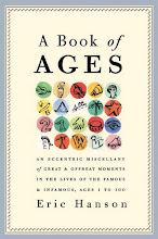
Lee Carlson, a colleague from my days writing for Skiing magazine, sent me this questionnaire. It's been traveling from author blog to author blog. What is the working title of your book? I have several books in various states of completion. Picture books, novels, stories that want to turn into novels, a novelette I'm adapting for the screen. Since this is a blog about my art, here are the picture books and illustrated books: MR. PONSONBY'S WAY WITH MICE and other stories; THE TERRIBLE TRUTH ABOUT GROWN-UPS; A CAR TRIP; BAD HAIR DAY; A NOSE IS A NOSE; NOTHING EVER HAPPENS AT THE BELVEDERE. There are others which I haven't worked on in a while. I have a lot of drawers full of material. Where did the idea come from for the book? Where do all ideas come from? Thin air. Actually, several of my picture book stories and my ghost stories began as stories I told to Madeline at bedtime. It's been a while since I've told her stories. What genre do(es) your book(s) fall under? Travel. Fable. Adventure. Comedy. Which actors would you choose to play your characters in a movie rendition? For my screenplay of the story, THE LAST ADVENTURE OF THE BLUE PHANTOM (published in McSweeneys24), I picture either Forest Whitaker or Denzel Washington. What is the one-sentence synopsis of your book? The titles usually tell what it's about. Or, as in the case of Belvedere, it's ironic and opposite to what happens. Will your book be self-published or represented by an agency? I have direct relationships with art directors and a few editors, but it's important to have an agent for books. Marly Rusoff sold my first book, A BOOK OF AGES, but I am represented by Sterling Lord for children's books. How long did it take you to write the first draft of your manuscript? I write very quickly or very slowly. Stories are quick. Novels take forever. I've not finished a novel yet. What other books would you compare this story to within your genre? My prose influences are Raymond Chandler, Roald Dahl, M. R. James, Evelyn Waugh. Who or What inspired you to write this book? I put a character into a situation and try to write them out of it. I think of a place or a time or a mood or a predicament first. What else about your book might pique the reader’s interest? Since books are such a speculative venture it's probably better to put people onto the book I have in print than the ones that may never get there. The best way to do that is to visit the website for A BOOK OF AGES––AN ECCENTRIC MISCELLANY OF GREAT AND OFFBEAT MOMENTS IN THE LIVES OF THE FAMOUS AND INFAMOUS, AGES 1 TO 100 (RANDOM HOUSE, 2008). It's a funny, surprising, fascinating, conversation-starting collection of stories from famous lives, arranged by year of age. (A perfect gift.)

Elves, Christmas Lights, Snow

I did this Christmas card for the Dutch design firm GBE and my friend Fritiof Eriksson. This idea just popped into my head. You never know where they come from. Merry Christmas.

Tuesday, October 30, 2012

Reagan the Lifeguard

I drew this a few years ago. You hear Republicans talking about individualism and the evils of government, but they seldom mention all the government props and support they get in the business community, the roads they use, the educated workforce they couldn't do without, the legal protections of their patents and trade agreements. The quote they like to trot out is this one from Reagan, about the scariest words in the world being "I'm from the government and I'm here to help." I don't suppose many people mind the government rescuing them from hurricanes or floods or fire. Do you think of firemen as socialists? I don't. But they're not profiteers either, and I'm glad of that. They don't ask for payment before they help you. Reagan himself was a government employee when he worked as a lifeguard. He didn't look at every near-drowning as a business opportunity. Helping can be a job, but it's also a citizen's duty, a neighbor's duty, and an obligation we all share in common through our democratic institutions. One of the presidential candidates wants to cut FEMA emergency preparedness by half. Can you guess which one?

Thursday, October 25, 2012

Political Geography-The Road to 2012

I did this illustration for Northwestern University to help them promote a panel discussion about the election. The event was titled "The Road to 2012". They'd seen the POETRY magazine cover I posted on my website and liked that look. I changed the houses from familiar suburban ramblers and moderns into 21st century mansionettes shaped like red and blue states (choosing states with recognizable outlines––there are a lot of rectangles.) In the final version we added signs with the electoral college count for each, but I like the basic version, which is more conceptual and interesting for being less concrete. Raul Torres art directed.

Monday, October 8, 2012

The Original Immigrants

I did this image for the remarkable Patrick J. B. Flynn, for an education magazine article about how to rethink our teaching of Thanksgiving to America's schoolchildren. The natives who greeted and helped the early settlers were a trusting and generous people, and we Europeans didn't repay them very well. Something to think about on Columbus Day. Of course, till the day he died, Columbus thought he was stealing land and gold from the Chinese.

Friday, September 28, 2012

La Table

Faith's birthday was the other day and I drew her a card. Usually I draw flowers, but I bought flowers, so I drew her favorite table in our living room. (Happy Birthday, Faith. Love, Eric.)

Wednesday, August 29, 2012

Lucky Jim


I never wanted to leave college. I'd found a place where your job was reading books. I liked the gothic architecture, the ivy, the rumpledness, the quiet. I did leave, but I still go back occasionally, usually by reading novels about college life, the best one being Lucky Jim, which I've reread every ten years or so with increasing admiration and relish. When NYRB asked me to illustrate the covers of Amis's novels for them I quickly began rereading them all, starting with Lucky Jim, which I found as richly amusing as ever.

I did several dozen drawings of Jim Dixon to start. I drew him with a pint in his hand, with a book, wearing a jaundiced expression, a bilious expression, a world-weary expression. Then I decided to do the reader a favor and let them visualize Lucky Jim how they liked. I turned him volte face, striding up a long sidewalk toward the college.

What college? He's a minor instructor at a minor redbrick college, not Oxford or Cambridge. Amis's biographers think he might have been visualizing Swansea (where he was teaching) or Lancaster or Leicester, but he doesn't say. I looked for appropriate examples of Midlands collegiate architecture and started drawing them. The final image is adapted from a wing at Liverpool University. I removed some of the soot and made the brick redder. Still, it looks appropriately prisonlike, because Jim Dixon doesn't like where he is. Unlike myself at his age, he longs for escape; the novel is escapist in that sense. Our hero is a boozer, a slacker, a mocker of authority, but in all things a colossal fuck-up, and his story is a masterpiece of slow-motion catastrophe. I hope I've done it justice.

Wednesday, August 22, 2012

Art for Gastronomica Magazine


Gastronomica called and wanted me to illustrate a story about pranks. Pranks chefs and sous chefs play on each other. A couple of approaches seemed to work. A plain funny drawing of chefs playing tricks––I drew something inspired by the MAD series Spy vs. Spy, sly looks, furtive cooks lighting matches in each others' cooking clogs. Another part of the story was about the phony equipment requests chefs send the new guy in search of. That's the idea that gelled. It required drawing a number of specialized tools that don't exist, never a problem for me. I think it turned out rather well. The art direction was by the excellent and seldom mischievous Frances Baca. Look for this art in the forthcoming issue. There are several articles in it that I plan to read over lunches this week...

Monday, July 23, 2012

Orientation, a book of stories

Here is the paperback cover of ORIENTATION, an intriguing book of stories by Dan Orozco. I did the lettering right down to the Faber colophon. Art directed by the wonderful Charlotte Strick. It was Charlotte's idea to throw a bright yellow behind these faces. Now the book practically jumps off the shelf. Brilliant.

Friday, July 20, 2012

Anniversary Flowers

Yesterday was our anniversary. I painted this bouquet, but also walked to the corner to buy her a real one. There is something endlessly intriguing about flowers, how they unfold and overlap.

Tuesday, July 10, 2012

Today's Art in the New York Times

I got a call from Alexandra Zsigmond yesterday. She art directs the New York Times op-ed page, and wanted me to do a drawing for the letters column. David Brooks had written about the Republican alternative to Obama's Affordable Care Act, which had just been upheld by the Supreme Court, and people had written responses to the column. It's hard to do a drawing of nothing, but I had the idea of drawing an elephant holding an empty box. I put a red cross on it to indicate it was a first aid kit, an apt enough analogy.


To make the elephant look more "congressional" I also put him in a suit.


The editors at the Times like to steer away from the hackneyed symbols when they can––the elephants and donkeys and Uncle Sams––so I also drew a senatorial-looking figure holding an empty box. To emphasize the emptiness of the box, I added a moth.


Word came back that they preferred the non-elephantine drawing and wanted it without the moth, which looked too much like a butterfly to them. They also thought it would be better to have the first aid kit covering more of the man's face, to make it more about the box. Adjustments made, drawing rescanned and sent, and this is the one that ran in the New York Times this morning. I like how it turned out.


While we're on the subject of elephants, I sometimes wonder if there aren't millions of Americans who vote Republican not because they like their policies but because they like elephants and perhaps hold a negative opinion of donkeys. I wouldn't be surprised.

Monday, April 2, 2012

Travel Art...Minus the Glamour


I did some art for the New York Times travel section last week, art directed by Shannon Robertson and Angelica Rogers. The topic was legroom in Coach, something I'm familiar with after many years as a travel writer. (Every year it seemed the seats got narrower and closer together...or was I still growing?) The conversation in the column was about the aggravation and aggression that close quarters generate. I drew it two ways for them to choose from. First I drew a conventional composition of unhappy travelers elbowing and scowling at each other. Then I tried to think what they reminded me of. Knees shoved up, shoulders hunched––and I thought of kiddycars, adults shoehorned into seats designed for children. This added the aggressive element that I was reading about. And why not make the kiddycars into small airliners? The space allotted for the illustration allowed me to decapitate two figures on the left, a natural consequence of modern travel.

Friday, March 30, 2012

A Tree at Lacock Abbey


I drew this from an old photograph of a tree at Lacock Abbey in Wiltshire. I couldn't draw it from life because I've never been to Lacock; I've been to Wiltshire. Anyway, the tree was blown down in a high wind a century ago. I find I draw better from an armchair, indoors, out of the wind. Sometimes what I draw can tell you where I'd like to be, but if I was there I doubt I'd draw. I might take pictures. I'd probably sit and read a book, no doubt about someplace else.

Monday, March 26, 2012

From the Sketchbook-an Old Bookstore


I did this drawing over the weekend from an old photograph of Foyles, the London bookstore. The largest, but not my favorite. My favorite haunt for books in London is a small side street called Cecil Court. It's off Charing Cross Road.

Friday, February 24, 2012

A Drawing of a Bridge in Bath


Bath is one of my favorite cities, and I'm sad to admit I've only spent two days in it, more like a day and a half, an evening in between. I hardly know it. I know it better from books by Austen and Smollett and Dickens and the films made from them. I did this drawing from a postcard I bought when I was there.

Thursday, February 16, 2012

Tulips


I did this drawing for my wife for Valentines Day. She loves tulips. (I also gave her roses.) The house on the pitcher is our house overlooking Lake Harriet.

Tuesday, February 7, 2012

Happy Birthday, Mr. Dickens


On his 200th birthday, the Great Inimitable is as funny and satirically brilliant as ever. And relevant too, in a world owned and operated by Scrooges. We could use a novelist with his righteous anger and his ability to change minds. I did this illustration several years ago for a Broadway production of A Christmas Carol, the show that Americans love every Christmas and forget immediately afterwards.

Wednesday, February 1, 2012

Roma


When it's cold and gray here in Minneapolis it sometimes helps to spend a little time drawing a warmer, sunnier place. Somewhere I've been, in this case Rome, my favorite neighborhood of the old city between Piazza Navona and the Pantheon. I can almost smell the motorino fumes.

Wednesday, January 25, 2012

The One About the Buddhist Temple


I stopped by the Co-op the other day and was looking at the magazines and happened across the art I did for Shambhala Sun last month. It turned out nicely. The story was about a Buddhist monk and an old temple in Japan. Being about zen and such things there were levels behind the obvious, which is what I tried to express here. Also, being zen, there wasn't a lot of action. This wasn't a Kung Fu story.

Monday, January 23, 2012

The Lotus and the Projector


There is something Platonic about the concept of reality projected on a screen. The idea dates back to Plato, in fact, referring to how we perceive reality secondhand and need to trust that it's true. The idea of a film projector was a central metaphor to a story I illustrated for the current issue of Shambhala Sun magazine, art directed by Liza Matthews.

Sunday, December 25, 2011

Bagatelle Story-frame 7


...and finally the culmination of what we'd been hoping for.
What had been hinted at, which is what prophets do in a vague sort of way...
Merry Christmas.

Saturday, December 24, 2011

Bagatelle Story-frame 6


...which becomes something surreal. This is what is called the transformation scene in the world of pantomime...

Wednesday, December 21, 2011

Bagatelle Story-frame 3


...a curved line becomes a world, a puppet theatre, a bearded face becomes a boot and a boot becomes a peninsula in the Mediterranean.

Tuesday, December 20, 2011

Bagatelle Story-frame 2


It's interesting how the shapes grow out of the painted line, almost like flowers growing out of the stem growing out of the ground, and how similar in silhouette a figure is to a flower or a leaf or a gondola to a continent.

Monday, December 19, 2011

Bagatelle Story-frame 1


I like to paint these small silhouetted stories during December, which is a time of stories. I've been doing a few this week. These are from a few years ago and comprise a story, a kind of ballet, no dialogue, just shadows. This is frame one.

Friday, December 16, 2011

An Overused Word


A couple of years ago I did a lot of drawing for a retail client in New York. As usual it was more than they could ever use. Most never got past the pencil stage. Luckily I hang onto pencils. I ran across a few of them in a folder the other day and got to playing with them. How do you make a cliché like "SALE" fresh and new? How do you make it eye-catching? You play with it. Like a jazz artist playing variations on a familiar tune.

Thursday, December 1, 2011

Winter Sports


I remember my dad taking us to a park years ago when I was four or five. I skated and my brother took his sled to the top of the enormous hill. Rink ice was hard if you fell, but you only fell from a couple of feet. Hills were for bigger kids and much scarier. It was a windy day and I remember later on my dad took the sled out on the rink. Standing on it with us at his feet he acted like a sail and we moved gracefully down the ice among the skaters, like some kind of strange buffalo among the flamingos. I may have been remembering that day when I painted this. There was a company in the town my dad grew up in that made ice boats. I don't know if he ever tried one out. I think the umbrella adaptation shown here would be worth experimenting with.

Tuesday, November 29, 2011

The Balancing Act


I did this illustration several months ago for the Cornell Law School magazine, art directed by Robin Awes. The topic was the difficult balance between philosophy and pragmatism. It's something encountered in law and politics but also in everyday life, in our work, even something as trivial as drawing pictures. We're always being asked to find a balance between ideal and practical, between good and bad or perfect and less perfect. What happens when the client's idea of perfect is different than our own? I used the monkeywrench to depict the practical and a Greek column to stand in for the philosophical ideal. Notice that the Greek column is a fragment from a ruin. Even the perfect isn't perfect.

When I taught professional practice at the College of Art & Design I had a lecture about another kind of balancing act. I asked my students, who were a couple months from entering the professional world: "What qualities make a successful illustrator?" We compiled two lists, one under the heading GENIUS, the other under RELIABLE. It's the same tension between practical and ideal. Work is a matter of negotiating a balance between the two...with an emphasis on the practical side.

Monday, November 28, 2011

Life is a Road


I drew this for our Christmas card a few years ago. A brush and mars black on paper.

Monday, November 21, 2011

My Debut in the New Republic


I did this double portrait of Bono for the New Republic that's on the newsstands now. I did about a dozen illustrations in all for the Lists Issue. Bono is on their list of "pseuds". Not having spoken with Bono recently, I can't say whether he's any phonier than other rock musicians who have political opinions. He does have nice eyewear though.

Here's another, this one depicting the overcoverage issue. Too much media attention about the usual non-topics. I've been an admirer of the design and the writing at the New Republic. The design is by the estimable Joe Heroun.

Thursday, November 17, 2011

What's On Your Mind, Part II


I have an exercise I do sometimes, to get my brain moving, to get the ideas from my head to my hand to my pencil. I draw a face. I draw an oval, or I draw the arrangement of features. Why are they always arranged the same, like a place setting? There's no law about that, so I rearrange the furniture, put the ear where the nose usually is, or insert a spoon or an automobile in its place. What is it saying to me? Usually nothing, but it opens a door to resemblances that we train ourselves to ignore. Rule-breaking is the first rule of art. The world isn't two dimensional but the paper is. The offbeat equations we make don't need to be outright surreal to be interesting. The brain is who we are, so why not draw it into that space? Is he asleep, or thinking, or dead? Sometimes the best drawing is inconclusive.

Wednesday, November 16, 2011

Pencil Line is Thought on Paper


I find that the simplest line usually conveys the most. If I'm trying to create a visual metaphor (a metaphor uses a concrete thing to embody something else, a concept or an abstraction) it's best to leave it unelaborated. The less specific detail the better. In this case the shape of the head becomes a kind of Venn Diagram. A more detailed drawing would beg for explanation: what's that other head doing there? In this simple context it justifies itself. Our eye explains it for us.

Monday, November 14, 2011

How Do You Draw Music?


I did this illustration for the Hartford Courant several years ago. Coming across it again reminded me how hard it is to visualize some things, like music or things heard and not seen. We resort to shorthand and code to explain music, which is what I did here. The story was about perfect pitch, who has it and who doesn't. Having it is easier to show than not having it. (It's hard to show something that's not there.)

After sketching around the idea for a while I decided to put one person right side up and the other upside down, to show they are hearing the same music differently. I had them identifying the musical pitch differently. Not just differently, though. What she identifies as "b" he says is "g" which works nicely because it's "b" upside down. Some things are simple to show but complicated to explain.

Friday, November 11, 2011

Tea Party


Compared to the space age equipment and the choreography, the whole apparatus of coffee-making, tea is simple. In Japan they have a ceremony, or so I've heard. My ritual is not ceremonious. I just try to get my tea ready at the same time as my toast, something any governor of Texas would be able to do without supervision.

This item is meant to hold the loose tea leaves together to steep, but even this is more high-tech than I usually am. Most mornings I resort to a tea bag. Liptons. (I used to use Twinings but I quit Twinings when they redesigned the little envelopes the bag comes in. I have a low tolerance for bad design.) Enough. My tea is getting cold.