
Wednesday, March 31, 2010
Alphabetismo
Much of illustration is making one thing look like something else. I see resemblances everywhere, and letterforms are so deeply imprinted it's no surprise that I see them in everyday things. To make a lettered title more interesting I'll sometimes substitute a thing for a letter, a palm tree for a T, a teepee for an A, in rebus-fashion. Turning men into semaphores is a challenge.


Tuesday, March 30, 2010
Rural Landscape
I did this for my favorite aunt yesterday. Since I was a kid I've been a deep observer of the rural landscape. I've depicted it with small penwork and fat brushstrokes, fine and loose black line and more recently with pencil. I am not immune to influences. Edward Bawden, Eric Ravillious, Thomas Hart Benton, Wanda Gag, Garth Williams, Andrew Wyeth and others. This one is a bit more Matisse than Currie or Grant Wood.


Monday, March 29, 2010
Half Title
This cookbook for Chronicle was one of the most enjoyable projects I've ever worked on. This was the half title, which is the page before the title page, an appetizer, an opportunity to play with lettering a little. It added nothing to the book. Just decoration––decorative fun. Like radishes you carve into rosebuds.


Thursday, March 25, 2010
Doodling
I learned that less detail makes the remaining detail more noticeable. You look at the small inflections, subtle emotions and the larger pattern because I left out the hair, the ears, the lips.


Tuesday, March 23, 2010
Experiments
A painting from my spectrum series. I paint things differently for the page than for hanging on the wall. Illustration is about subject but a painting on the wall can be about anything or nothing, like this one. So why do I love looking at it and what am I seeing? A critic could probably explain it for me and I could paint an illustration of what he explained. By the way, I am still looking for a new gallery to sell my art.


Monday, March 22, 2010
The Naked City
I remember riding the train into the city when I was a kid, thinking to myself that there were people inside all of those buildings. That there was something going on inside every window, between people I didn't know and would never meet.


Friday, March 19, 2010
There is no rhyme or reason
It would be interesting to put this in a frame on a wall and sit with a magazine nearby listening to what people thought it meant. Usually I reject juxtapositions that seem meaningful, unless the meaning is absurd or funny. Funny to me will usually not be funny to anyone else. Am I an obscurist at heart? Or is it just perverse?


Thursday, March 18, 2010
A Globe and Not a Globe
The nice thing about pencil line is it's unrehearsed. The thought comes right off the top of my head onto the paper. The roughness allows one thing to be another thing without making the viewer stretch too much. More simile than metaphor, maybe. Stories are written first in pencil.


Wednesday, March 17, 2010
Assorted Items
I've been drawing still lifes lately. Arranging items in a certain way says something. It implies a message even if there isn't one, a relationship or a causation you never intended. Why else are these things together? My book uses this same trick. Setting anecdotes and people next to each other strikes up a conversation between them.
This arrangement of toys and people was done for a paper promotion designed by Besser Joseph years ago. The items have a loose connection having to do with the initial letter L, and some other tropes I can't remember. As I look at it now I can almost make sense of it, but it's probably not the sense I intended when I painted it.

This arrangement of toys and people was done for a paper promotion designed by Besser Joseph years ago. The items have a loose connection having to do with the initial letter L, and some other tropes I can't remember. As I look at it now I can almost make sense of it, but it's probably not the sense I intended when I painted it.

Tuesday, March 16, 2010
The Monday Warm-Up
To get the machinery started I like do a little random drawing. Things I see around me. Still lifes of kitchen items, fruits and vegetables, knives and forks. Forks are trickier than you think. Hands aren't easy either, as I've mentioned before. I used to hate drawing them, mostly because I was bad at it. (Interestingly, I saw a stock-house illustration in the paper yesterday that had the left hand at the end of the right arm, and vice versa. I don't think it was intentional.) I've gotten pretty good at hands since then. One thing I've discovered, though, is the more perfectly drawn they are the less they suggest. An awkward drawing always works better at conveying metaphor, probably because our eye stops and tries to make sense of it. The less distinct it is the more it might be something else.


Monday, March 15, 2010
Man on Bicycle
It's the first warm Monday of the year. Makes you want to take the day off and grab your bicycle.


Friday, March 12, 2010
City Maps II

I did this map in black line for Robert Valentine. It was Robert who did the colors and had it so beautifully letterpressed. The client was an important literary agent who was moving from the upper east side to midtown. In other words it was a moving announcement, but rather more glorified than such items usually are. Surprisingly enough it was singled out as one of the best printed pieces of the year by ID, the international design magazine. There was cleverness in the drawing, but it was the elegance of the execution that made it memorable. I like how I magnified the street grid slightly inside the magnifying glass. The glass was also my idea, as were the little jokes inserted around it. But it needed to be clear and eye-catching, and that was Robert's doing.
This map is a enormous departure, but does the same basic things. Just a map of a well known New York neighborhood, but with less persiflage. I drew it as someone would draw on a cocktail napkin. Rough, blunt, offhand. Pencil line has more candor to begin with and deserves to be used more. I did a San Francisco map for Random House once, for a book about the Beats. It was careful and clear, and I wish I'd done it carelessly and roughly, more like this. It would have contained the same information but would have suited the milieu it depicted.

Thursday, March 11, 2010
City Maps
I did this map for a corporate client sometime in the 90s. It's always been a favorite of mine. The art director was Megan Taylor. Since it was the centerfold of the publication, Megan had the clever idea of doing the title lettering in a pop-up, which was fun. It's exciting to see what art directors might do to take my art to another level.
A city map presents a whole different set of demands from a regional map. Which streets to show, which to leave out. Which landmarks to illustrate, and how to integrate these illustrated elements in a way that doesn't confuse the eye. I like to think of the street grid as a floor painting on which these illustrated elements are choreographed. Map illustration is more than a simple rendering of a place; it requires re-imagining it. I think it's important to have a rationale like this, a set of rules, so that the concept doesn't get muddled or too elaborate. After many years drawing maps, these rules and tricks have become second nature to me, shaping how I visualize a place. When I read about travel I always look for a map, always want one. I need to know where I am, and where the writer is leading me.

A city map presents a whole different set of demands from a regional map. Which streets to show, which to leave out. Which landmarks to illustrate, and how to integrate these illustrated elements in a way that doesn't confuse the eye. I like to think of the street grid as a floor painting on which these illustrated elements are choreographed. Map illustration is more than a simple rendering of a place; it requires re-imagining it. I think it's important to have a rationale like this, a set of rules, so that the concept doesn't get muddled or too elaborate. After many years drawing maps, these rules and tricks have become second nature to me, shaping how I visualize a place. When I read about travel I always look for a map, always want one. I need to know where I am, and where the writer is leading me.

Wednesday, March 10, 2010
Other Places
Today I'm painting a map for the Washington Post, so I thought I'd post a map. I've always loved maps, looking at them, drawing them, collecting them. A map is an entirely artificial construct, a mental image, in other words it's something a photographer can't do with a camera. It's cloudy and rainy out today, so here's a sunnier place to contemplate, with its various attractions painted large.


Tuesday, March 9, 2010
Happy
Drawings sometimes invent themselves. I put them down the way I take a message for my wife, assuming the information is self-explanatory. For instance, I don't know what the arrow means in this one, but I'm sure it makes perfect sense to you. Happy is a very fungible word, useful in any context. I could have put it next to a drawing of a frowning man and you would assume I meant it ironically. Actually, I drew this in an ironic mood. Maybe the arrow implies irony. Maybe irony is in the ear of the beholder.


Monday, March 8, 2010
Chateau
Besides being the worst driver in American literary history, Nathanael West also etched an interestingly surreal portrait of Hollywood, the town where he spent his twilight years. The surrealism amounted to dead accuracy, of course. Scenes of cowboys and Indians seated at café counters and fairy tale cottages planted adjacent to miniature haciendas in the Hollywood Hills. When I finally arrived in L.A. I was disappointed to discover there wasn't actually an immense building spelling out "20th Century" like the one that preceded pictures by 20th Century Fox. There was the Hollywood sign, however. And this authentic chateau located on Sunset Boulevard. Where Jim Morrison used up the eighth of his nine lives and Helmut Newton and John Belushi died and F. Scott Fitzgerald nearly did, where Garbo and Montgomery Clift and James Dean and Hunter S. Thompson slept.


Friday, March 5, 2010
Baby You Can Drive My Car
I love toys. Not only are they a fun timewaster in the studio, they offer a useful metaphorical tool. Things not plausible in real life often make sense as a toy. This pencil style I've been playing around with has a different effect: pencil gives things a documentary feel, as if they've been seen and recorded. Pencils also come directly out of the artist's head, with none of the smoothing-out that a more finished medium adds. It's more off-the-cuff, more sincere, more suggestive. What does this drawing suggest? We use the phrase "remote control" in a disparaging way, so maybe it could add an ironic commentary to a story about a pol who's controlled by others. Just off the top of my head.


Thursday, March 4, 2010
Tricks
Experienced illustrators who have spent years honing their craft are capable of some amazing tricks. This is just one of them that I do when people stop by the studio. While balancing these items on my nose I was also able to put more hair on my head.


Wednesday, March 3, 2010
Purely Decorative
In our everyday lives there's no burning need for decorative borders, but they're nice. They're usually there for a reason. The elaborate baseboards at the foot of interior walls were put there to keep the mop from dinging the plaster. The leather hem on a car coat keeps the sleeve from fraying. In fashion, in the built landscape, in graphics, minor extras usually have a practical reason. Making them look nice is just a courtesy, which may be why designers are so polite. I did these decorative borders for Lisa Catalone, who was designing a neat mailer for a school back east. Besides the useful illustrations, I did lettering that she turned into a font, and these decorative borders which she used to make the individual cards look special, which is what made people linger over them and read what they said.


Tuesday, March 2, 2010
Global Warming: the snow shovel's perspective
With all of the snow falling back east I'm guessing millions of people think global warming was a figment of Al Gore's imagination. The scientific explanation takes too long for people to digest, but it sometimes helps to invent a visual that puts it in a nutshell. There's the snow-shovel, and the earth on it is melting. I did this drawing yesterday for the New York Times letters page; it appears there today.
As I understand it, the snow is a downwind effect of climate change. If it sounds illogical think of how Arabs drink hot coffee to cool off. Any massive shift in climatic conditions is bound to spin off contradictory effects in different places: droughts, floods, locusts, hurricanes. Which may explain why apocalyptic Christians are so delighted.
I started playing around with this pencil style about a week ago. This is its first appearance in print. Aviva Michaelov is the art director.

As I understand it, the snow is a downwind effect of climate change. If it sounds illogical think of how Arabs drink hot coffee to cool off. Any massive shift in climatic conditions is bound to spin off contradictory effects in different places: droughts, floods, locusts, hurricanes. Which may explain why apocalyptic Christians are so delighted.
I started playing around with this pencil style about a week ago. This is its first appearance in print. Aviva Michaelov is the art director.

Friday, February 26, 2010

Thursday, February 25, 2010
Begs For Animation
Something about the ephemeral line, the little smudge of fingerprint (or is it sweat?) around the edges of the drawing, suggests animation. Drawing is temporary to begin with. It's less permanent than paint. A scrap of paper, a pencil pulled from a pocket, something seen that won't be there in a moment. So why not animate the pencil drawing itself? Of course I didn't see this guy in his running shorts; I made him up. I gave him that serious expression, the average physique, the short socks and shorter shorts. I drew him and as a joke on him I put that chair in his way. He hadn't expected it, believe me. Someone will need to animate him for us to find out if he cleared it.


Wednesday, February 24, 2010
Olympic Fatigue
Maybe it's the costumes. Or the announcers. The short skis. The kiss and cry. The earth-shaking achievements of athletes on snowboards. Are they athletes? Are bowlers athletes? Was Evel Knievel an athlete? Do I have an opinion?


Tuesday, February 23, 2010
Man and Horn
There is something about pencil line. It seems to come right out of the imagination, without hesitation or thought or technique.


Monday, February 22, 2010
Metaphor (With Shoe)
Sometimes a little drawing will surprise you. I mean, what is this supposed to mean? Is he downtrodden? Is he a creative director for Kenneth Cole? Is he channeling Philip Guston? Whatever. I drew it on Friday and have felt smug about it all weekend. Not a bad feeling. Anybody who looks at art gets to make up his own mind what it's about. I hope you like it.


Friday, February 19, 2010
An Eager Student
I remember one kid who not only raised his hand and waved it; sometimes he'd start running down the aisle towards the teacher's desk. He didn't always have the answer, but he thought he did. Maybe I should write a story about him. I didn't raise my hand very often. Probably because I was too busy drawing airplanes and battleships. I still do airplanes once in a while, but I haven't been asked to draw a battleship in years.


Thursday, February 18, 2010
Tailor's Dummy
Fashion furniture like this invites a bit of Joan Miro, a bit of Max Beckman, reducing a thing made of fabric into a piece of machinery. It isn't easy because fashion is so vertical and drapy.


Wednesday, February 17, 2010
Birds in Tree
I'm a student of patterns. How leaves fill a tree's interior space, how vines occupy a fence, how blackbirds organize themselves in flocks, organic and inorganic patterns like brickwork and windows on tall buildings, the way people sprawl across grassy spaces. Knowing the algorithm for such things would ruin it. Everything can be reduced to numbers, but I'd rather paint them. Patterns are reassuring, which is why we put them on wallpaper and fabrics and wine labels and dishes. Pattern is the counter-argument to randomness and disorder. I often insert an element of imperfection, though, to keep it from seeming precious. There are dead branches lopped off here and there and I don't think the birds like each other very much.


Tuesday, February 16, 2010


Monday, February 15, 2010

Sunday, February 14, 2010

Friday, February 12, 2010
Exercise
They say exercise is good for you. I did this illustration for a seniors magazine. The editors might have been visualizing a circle of old people doing something with colorful scarves. But that would be unambitious, the sort of thing you ask a photographer to capture. An illustrator can get a well-toned septuagenarian to lift 500 pounds. Easy. Kind of makes you think.


Thursday, February 11, 2010
Life's Merry-Go-Round
Carnivals. Cute children, cotton candy, games, carefree summer nights, singing crickets, carnival barkers advertising rigged games of skill, carnies, sideshow freaks, crime, carnality. This illustration leaves out the darker side, which is what calendar art does. Leave the other side to films like Gun Crazy and Strangers on a Train.


Wednesday, February 10, 2010
Think Warm Thoughts
It's snowing a foot an hour in New York today, and I'm sending my friends there encouraging thoughts and instructions, like how to sit comfortably atop a steam radiator, how to thaw frozen extremities while eating an elegant lunch. Sometimes it's best to think of warmer places. In this economic climate I don't know how many beach vacations are in my future but I can still draw them when called upon. Unlike a photographer I do not need to be flown to a tropical island to conjure a woman in a swimsuit, but if flown I will conjure her even more convincingly than this. I did this calendar for a Japanese client back when Japanese clients published calendars.


Tuesday, February 9, 2010
Chap in Turtleneck and Goatee
You see the type hanging around gallery openings and book signings, looking more like the artist than the artist himself. I don't think I have the seriousness required to wear a goatee successfully, and my sportcoats only leave my closet for funerals. I wear turtlenecks in the studio––for warmth and comfort only. I envy people who get to put on the full costume and look important in public. Drawing figures like this in my sketchbook is a way of pretending.


Monday, February 8, 2010
The Movie Business
I did this for the LA Times a few years ago. The story was about how everybody wanted to be a movie producer. Tell me about it. Bold, simple art like this can really liven up a page of gray newsprint.


Friday, February 5, 2010
Gardening Thoughts
It's snowing out today and everything looks like its coated with sugar. It's a kind way to describe transportation hell. Luckily my studio is just upstairs. For those of you who are tired of boots and winter coats, here is a little bit of Spring. I painted this for House & Garden I think. The article was about the civilized crime of stealing cuttings from other people's gardens, which I don't think is a felony in most states. My own backyard is full of blue violets stolen from my grandfather's backyard in Wisconsin forty years ago. Twenty years ago they moved again from my parents backyard in the suburbs to my city lot. The transportation of violets out of Wisconsin actually is a crime because the violet is the state flower. I remember worrying the cops were going to pull us over. They didn't and the statute of limitations is hopefully up by now.


Thursday, February 4, 2010
Terrible Horrible Edie, take two
This cover illustration is very different from the one I posted yesterday. Same artist, same brushes, same drawing board, same colors even. Sometimes the line is less smooth, less liquid. It has to do with the brush I pick up, probably one that's been roughed up a bit, but occasionally the paint is simply different, as if it decides "today I'm going to clot and dry quickly on the brush." It might have something to do with the humidity. I've been doing this for thirty years and I can't explain it.
An artist wants predictability and uniformity. But art is better when the artist isn't on auto-pilot. I painted something the other day which came out very differently than I expected. The sky glopped up on me and overlapped the buildings, some of the lines looked like I'd painted them with a stick, some were as fine as a single sable filament. I hurried on, didn't slow down to force the medium to behave, hurried to finish it off as an experiment. The awkwardness infused something special into the picture. Now all I need to do is remember how it happened so I can go there again.

An artist wants predictability and uniformity. But art is better when the artist isn't on auto-pilot. I painted something the other day which came out very differently than I expected. The sky glopped up on me and overlapped the buildings, some of the lines looked like I'd painted them with a stick, some were as fine as a single sable filament. I hurried on, didn't slow down to force the medium to behave, hurried to finish it off as an experiment. The awkwardness infused something special into the picture. Now all I need to do is remember how it happened so I can go there again.

Wednesday, February 3, 2010
Terrible Horrible Edie, take one
I got a call from New York Review Books last fall. One of my favorite publishers. Not only for lovely intelligent books adults read but the neglected children's classics, like this one. I'd never read it before. Not that I avoided books with girls in them. One of my favorites was (and is) "Mistress Masham's Repose" by T. H. White. Anyway, it was pure pleasure to try to capture Edie. Not as terrible or horrible as you might think, at least not unless provoked. I liked the sketches so much that I painted them all. The book is supposed to appear some time in the fall, with another illustration I painted for it.


Tuesday, February 2, 2010
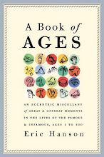
A Book of Ages
When Whitney Cookman was designing the cover of my book in 2007 I showed him several of my dot paintings. He liked this one and used it. It has an apt pointillism; the book is, after all, a 300 page accumulation of pointed anecdotes, unrelated but linked by the accident of being placed next to each other, having taken place in the same year-of-age. What plot the book sustains is invented in the readers mind. The stories are amusing and bite-sized, like the candy the cover art seems to suggest. The paperback edition, published today by Three Rivers Press, has a different cover with a bright orange balloon on it, not painted by me. The balloon is supposed to push the idea that A Book of Ages is a perfect birthday gift, and it is that. Subtlety doesn't usually sell a million copies. But I did like the candy-colored dots.


Monday, February 1, 2010
Palm with a Dry Brush
There is a texture you can only get with a dry brush. It's hell on the brush, but the effect is interesting and delicate. I think this would be an interesting image for the cover of a book. It's a palm tree viewed through parted curtains, at night. One of a series painted for gallery sale.


Friday, January 29, 2010
Stress
The article was about stress. Its sources didn't surprise me. How many people did they need to study to learn that medical diagnoses cause stress, or taxes, or bills, or bosses, or children that speak to you like Robert DeNiro in one of his mobster roles? My idea was to show an Everyman being hounded by all these things. This is what illustration does better than photography. A person photographed for this story would have looked confused or unhappy or maybe constipated. It appeared in the LA Times.


Thursday, January 28, 2010
Bagatelle no. 25
What do these mean? What do they suggest to you? And where was my head at when I began Bagatelle no. 1?
The first two in this series were painted for a gallery show in Florida that never came off. (The gallery folded the week I showed up for the opening.) Numbers 1 and 2 were in American Illustration a few years ago, but no design or ad work has come of it. The New Yorker asked me to do a series of these but never published them.
They are peculiar, allusive and vague. If they are "fine art" maybe I have no business doing them. Maybe they are the visual equivalent of my recent short stories, the ones that connect up but never answer the questions raised. These stories have been admired but, again, never published. If this category of work is a dead end it is at least an interesting and thoughtful one, but nobody these days pays people to think or suggest things they can't resolve neatly.

The first two in this series were painted for a gallery show in Florida that never came off. (The gallery folded the week I showed up for the opening.) Numbers 1 and 2 were in American Illustration a few years ago, but no design or ad work has come of it. The New Yorker asked me to do a series of these but never published them.
They are peculiar, allusive and vague. If they are "fine art" maybe I have no business doing them. Maybe they are the visual equivalent of my recent short stories, the ones that connect up but never answer the questions raised. These stories have been admired but, again, never published. If this category of work is a dead end it is at least an interesting and thoughtful one, but nobody these days pays people to think or suggest things they can't resolve neatly.

Wednesday, January 27, 2010
Restauranting
I did this illustration for Los Angeles magazine, art directed by the excellent David Armario. The story was about Musso & Franks, a Hollywood hangout that some say is haunted by the ghosts of the stars who once lunched there. Curious to know if you can identify any of these famous faces.


Tuesday, January 26, 2010
Inventing an Icon
The best iconic images are blunt. Simple. Realism is unhelpful, really. It's distracting. When I was working on this I'd recently been working on a series of gesture images, with a more painterly and realistic outline, so I took effort here to make the fist awkward. Awkward because protest isn't graceful or lovely, it's rough and tumble, but also because awkwardly drawn anatomies are more sincere somehow. Cimabue is more sincere than Raphael. Ben Shahn is less slick than Norman Rockwell or Andrew Wyeth. It's as if we see the imperfections in a rendering and feel the need to look past them for something more. It isn't a realistic diagram or rendering so it must mean something too. Realism is itself. Unrealism is more suggestive.


Friday, January 22, 2010
Underfoot
There are things a drawing can convey better than a photograph can. It's hard to photograph a feeling or an idea, an abstract relationship, a sense of oppression or liberation. Sure you can show the look on an individual face, and that's real, but even that is open to interpretation, relying on context or subtext for its meaning. A drawing can express something without explaining it. You nod your head without even knowing it.


Wednesday, January 20, 2010
Iconography
This is one of my favorites from the dot series. I love it because it is so meaningless, which is another way of saying it could mean anything. I do no sketches and study no reference for this kind of painting. I carefully paint the dots, then quickly add the icons. I can't be thinking of anything or looking at anything or trying to say anything, which sounds kind of like bullshit. I suppose it is. I'm curious to see what comes out of the brush when I'm not trying to draw anything in particular. If something concrete comes into my head I make sure it's painted upside down. This is called method. It's a variation on the method I use to paint bagatelles, a way of tricking the subconscious into committing itself to paper.


Subscribe to:
Posts (Atom)

 Posts
Posts


