Wednesday, June 29, 2011

Tuesday, June 28, 2011

Office Tools


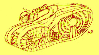
One of my limbering up exercises is to draw something nearby. Preferably something with a little elaboration to it. It's as much to limber the eye and the mind as the hand. Drawing something real teaches you not to fake or anticipate or invent, and often as not the seen is intriguing enough in its native lines and construction.


The imperfection of the drawing is part of its interest. Why did I make this mistake here or misconstrue that attachment? Made things have shapes and curves that are just as sexy as the human body, or almost, or perhaps we see allusions from one to the other. Maybe designers gravitate toward the sexual when shaping things. Sometimes, though, a hole punch is only a hole punch.

Monday, June 27, 2011

Untranslatable (Verbal vs. Visual)


Over the weekend I illustrated another Untranslatable feature for wwword.com. (Edited by my friends Lucy Sisman and Tamara Glenny.) Always fun; always educational, the column discusses words and phrases that don't travel well from one culture to another. Translating words into images is difficult enough in one language. Luckily the job of explaining is left to the writer. My job is to make the adjacent text look interesting, to highlight the culture it's from, write out the word and hint at the meaning. Overexplaining is a sin among illustrators, which is why we use shorthand. Gestures, icons, puns, allusions. These tricks go back to the ecclesiastic art stuck up on church walls to occupy the faithful who couldn't read and didn't comprehend the Latin liturgy anyway. This drawing is a lot like these medieval puzzle pictures, although it's more playful than complex. The smug face (are any people as smug as the Swiss?), the protective hand, the national flag, the iconic Matterhorn, the word in question, layered in colors the way language is layered with meanings.

Friday, June 17, 2011

Little Drawing, Big Topic

I did some art yesterday for the New York Times op-ed page. The topic, while not as important as the sexual foolishness of a congressman, is pretty important: congressional gridlock, two political parties unable to compromise. Not a sexy issue. Given such a small space the key is to convey the essence in as few lines as possible, so I drew two angry men face to face. I drew them several ways.


To underline the nature of the confrontation I thought of overlaying the word NO in a gray tone.


I liked the look, but wondered whether it added nuance or unhelpful complexity. Did it distract? The point of this small illustration in the letters column isn't to make readers stop and make sense of it but to make them read the adjacent letters. We left the word NO out.

The word NO also conveyed a false equivalency. It implied that both parties were saying NO with equal force, which I don't think is true. One of the two parties has shown a greater flexibility over the past decade. Yes, they are both angry, but I think the one party (the one on the left) is angry because it's tired of always giving in.

I'm saying this very carefully because the illustrator's job isn't to shape the meaning but to convey it, which is also the job of journalists. I think False Equivalency is a big problem. If there are two sides to an argument a journalist is supposed to impart both of them in a fair manner. This sometimes puts the writer in the uncomfortable position of treating foolishness and intelligence the same, or fairness and bigotry, or greed and generosity. If you equate moderation and extremism equally and without any negative weight on one side, after a while the more extreme position is rewarded and encouraged.

Is it a cop-out for an artist to go only as far as the text goes and no further? Or is that his job? A lot of thought and worry goes into a small drawing.
Tuesday, June 14, 2011

June Sky


It's one of those perfect days in June and I moved my studio onto the screen porch for the morning. There have been some strange gyres and bumps this past week but today is quiet and pleasant and the clouds in the sky are the kind that don't worry anyone. Today is plain all right. I am busy drawing, waiting for the next big project, working on some writing I'd set aside, doing what I do well.

Friday, June 3, 2011

The Corporate Ladder

Sometimes metaphors invent themselves. You dream them, or daydream them, putting them together out of puns and wordplay. I did a series of drawings beginning with the little walk we do with our fingers. This drawing grew out of that. I'm not sure what it means. Is it the corporate ladder? Or is it life's ladder, a kind of Jacob's ladder that ends who knows where? Tops of ladders always seem dangerous to me.

Wednesday, June 1, 2011

Les belle dames sans merci

I remember the line from Tennyson, but I can't remember if it is the beautiful woman without mercy or the beautiful woman who always says "No, thank you." Don't blame me for the mercilessness of these faces. I drew them after leafing through a copy of Vogue.